

WHY SO SERIOUS?
The Joker Jersey project was a highly personalized creative piece designed as a custom project for a personal client. The goal was to build a unique jersey identity by combining three of her favorite things—Jeeps, bulldogs, and Nike-inspired styling—into one cohesive and meaningful design. The direction focused on blending personality, symbolism, and creativity to create something that felt both stylish and deeply personal.




Brand Marks
Primary Logo
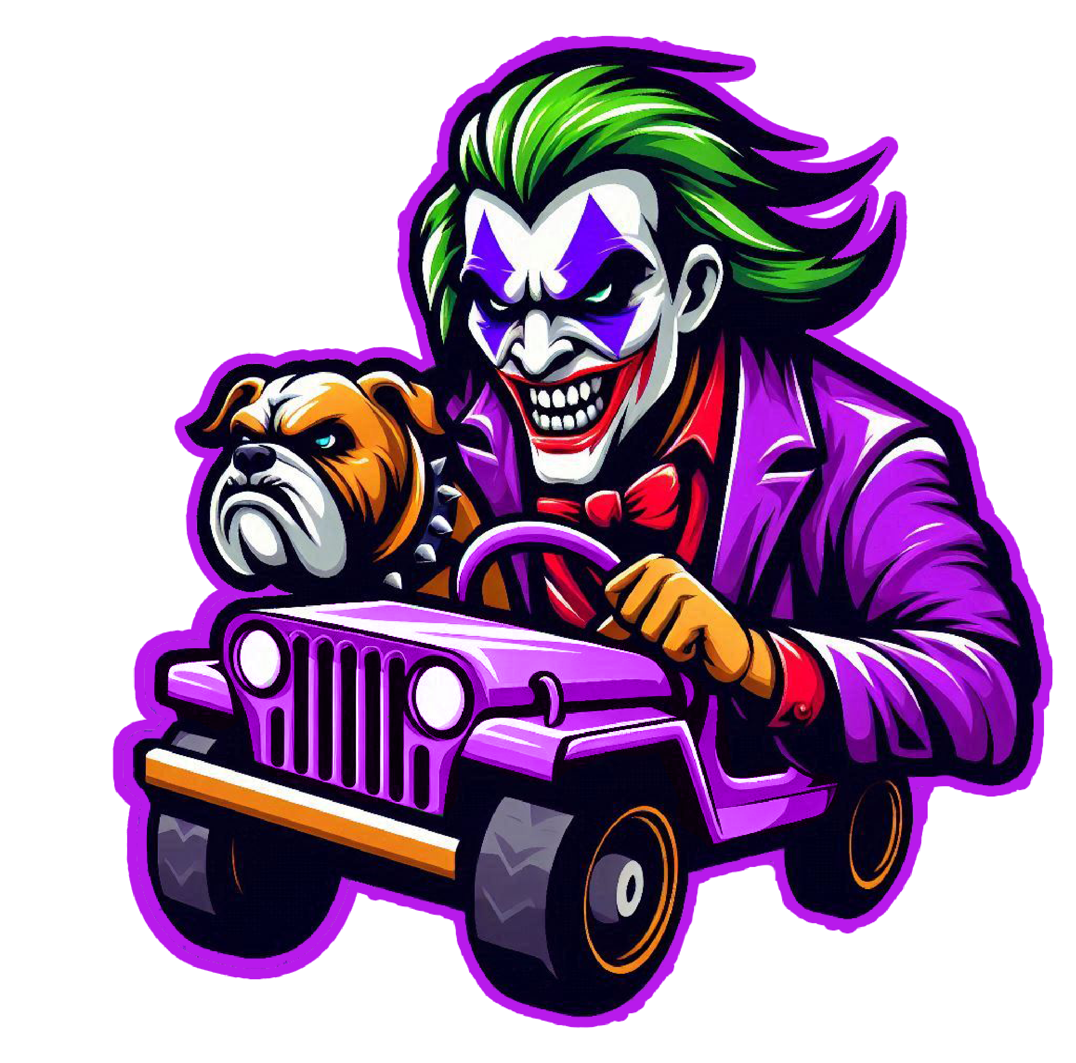
The primary mark centers around a custom purple Jeep design that brings together the core elements of the project in one unified scene. Inside the Jeep sits a stylized version of the Joker, while a bulldog rides alongside him, creating a playful yet personal composition. This version represents the foundation of the identity, blending all three of her favorite things into a bold and expressive centerpiece.
Secondary Logo
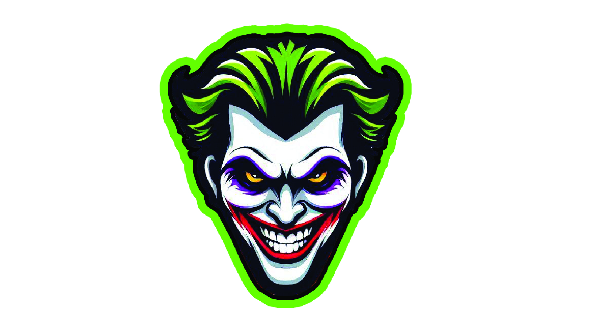
The secondary mark focuses on the Joker’s face as the main design element, exploring different expressions and makeup variations to represent his shifting personality. This version reflects emotional depth and character variation while maintaining a strong visual connection to the overall theme. It adds contrast to the primary logo by shifting focus from storytelling to character-driven identity.
Bulldog Joker Supporting Mark
The tertiary mark simplifies the identity into a bulldog designed with Joker-inspired styling. Featuring playful makeup and character details, this version turns the bulldog into a symbolic side character within the brand. It functions as a strong accent mark that reinforces personality, loyalty, and the connection between all elements of the jersey design.
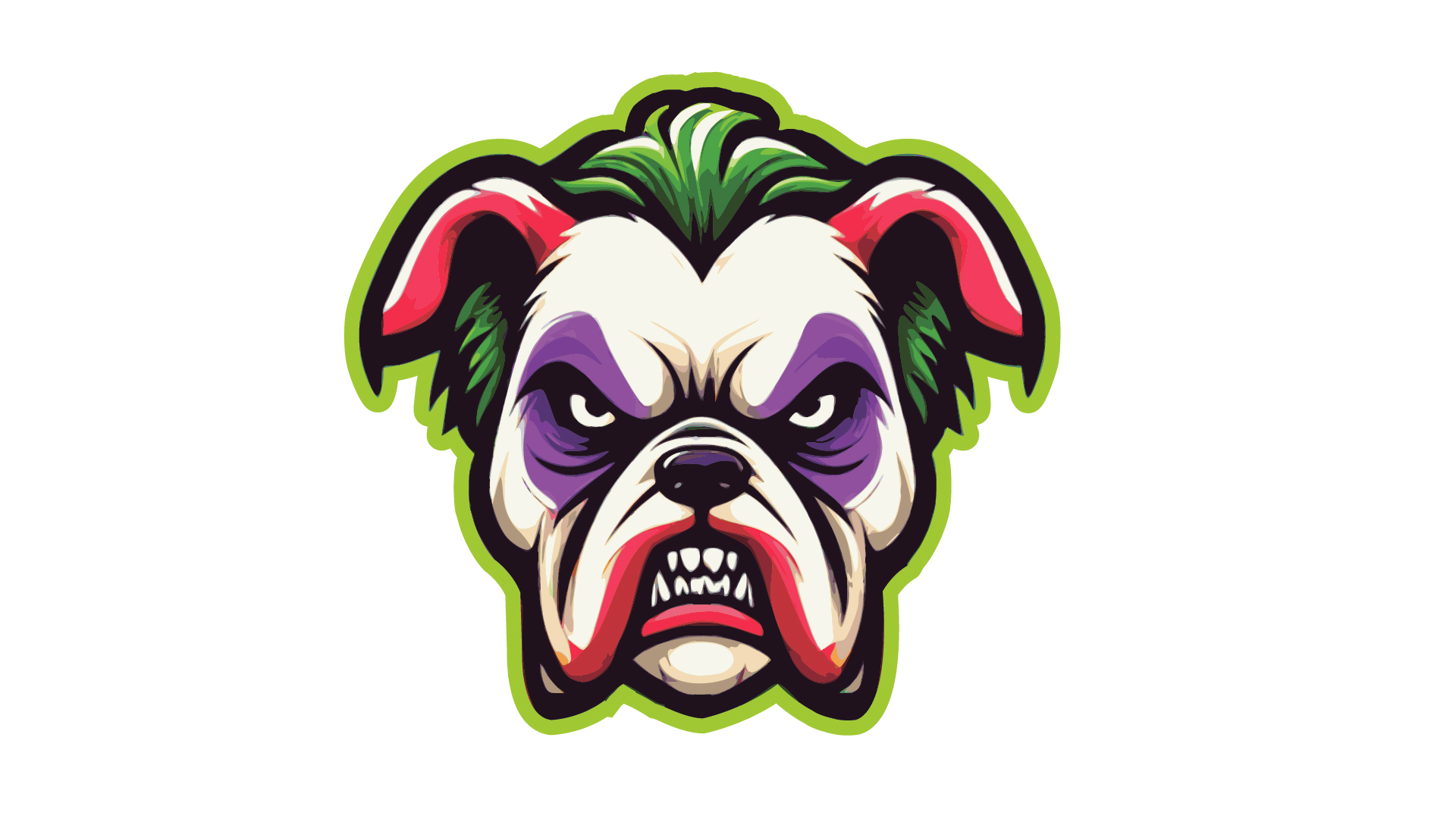
Bulldog Joker Supporting Mark
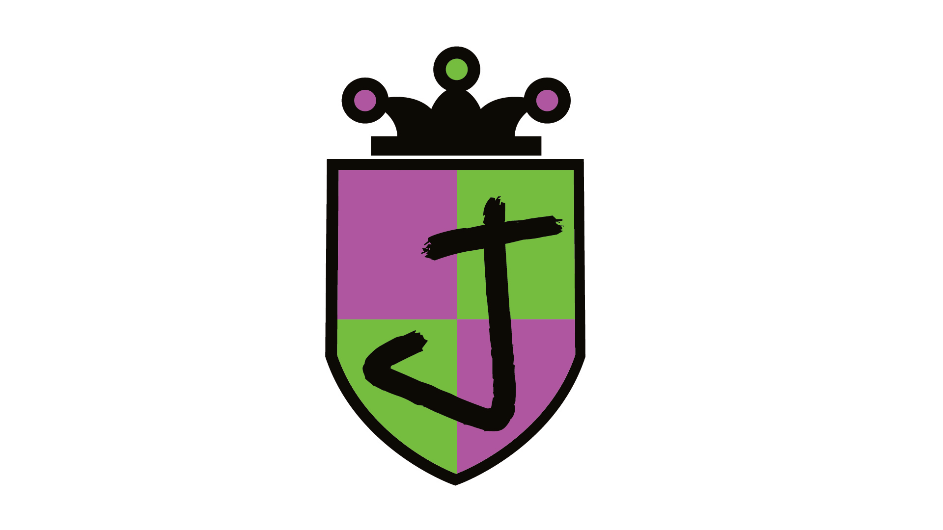
The last supporting mark is a custom Joker shield that features the iconic colors green and purple of the Joker. To tie in the theme features the Jokers hat. The J in the shield is the Jokers font and is used throughout the jersey as the signature typography.

