LITTLE CAESARS AAA HOCKEY
Following the success of the Chicago Mission Winter Classic project, Little Caesars approached me to develop a full creative direction for their 2024 Winter Classic identity. The goal was to reimagine their iconic brand through a hockey-focused lens while maintaining the recognizable essence of the Caesar character. This project gave us the opportunity to translate a globally known corporate mascot into a competitive sports environment, creating a system that could stand alongside their Winter Classic opponents while still feeling authentic to the brand.




BRAND MARKS
Primary Logo
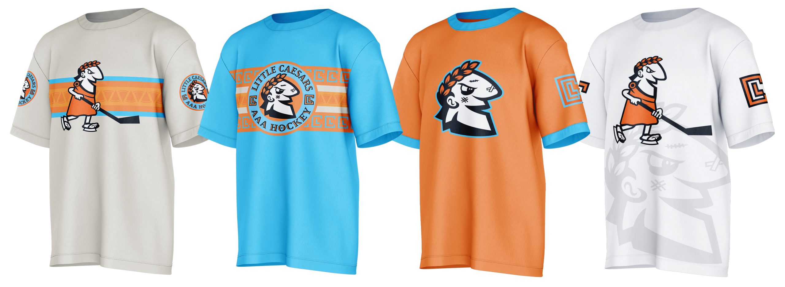
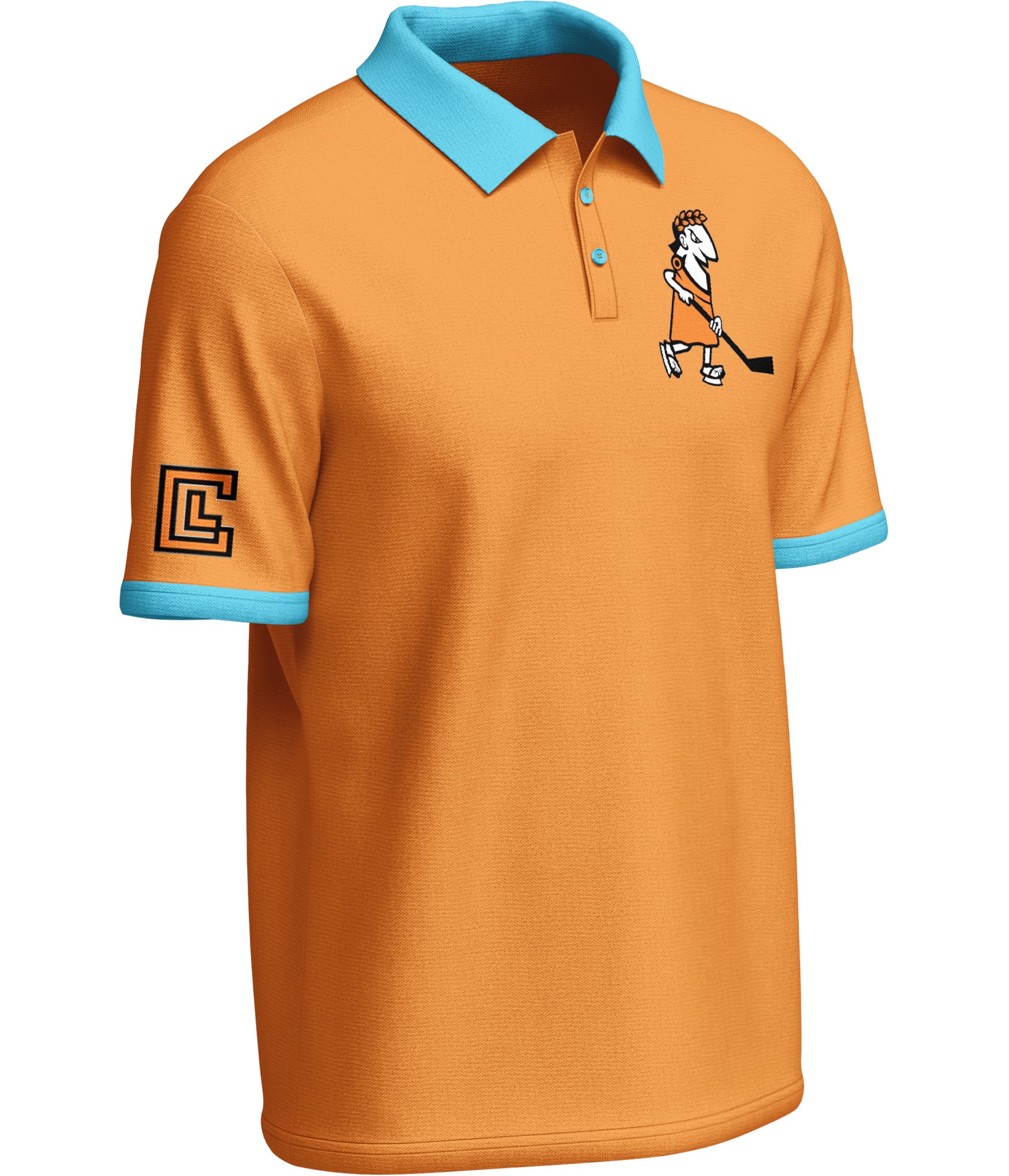
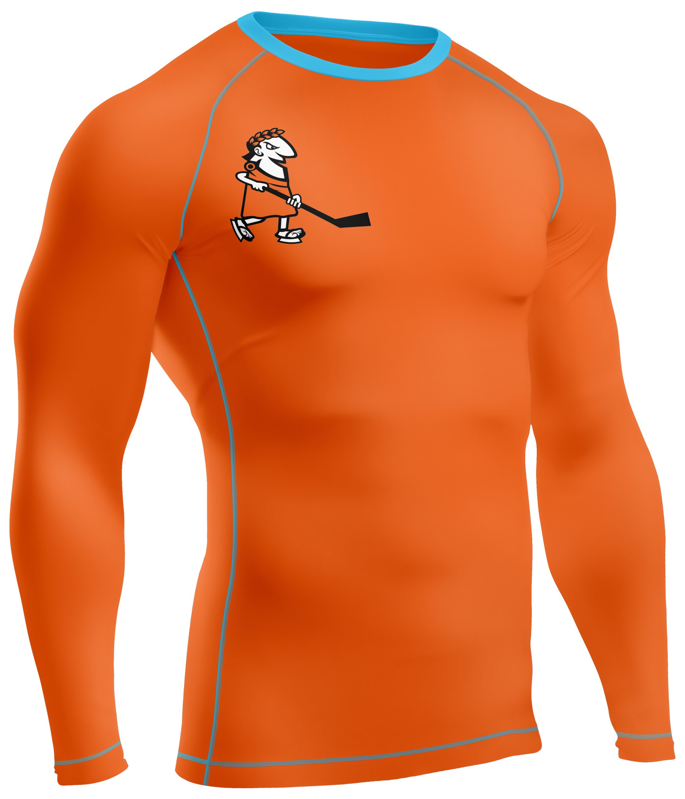
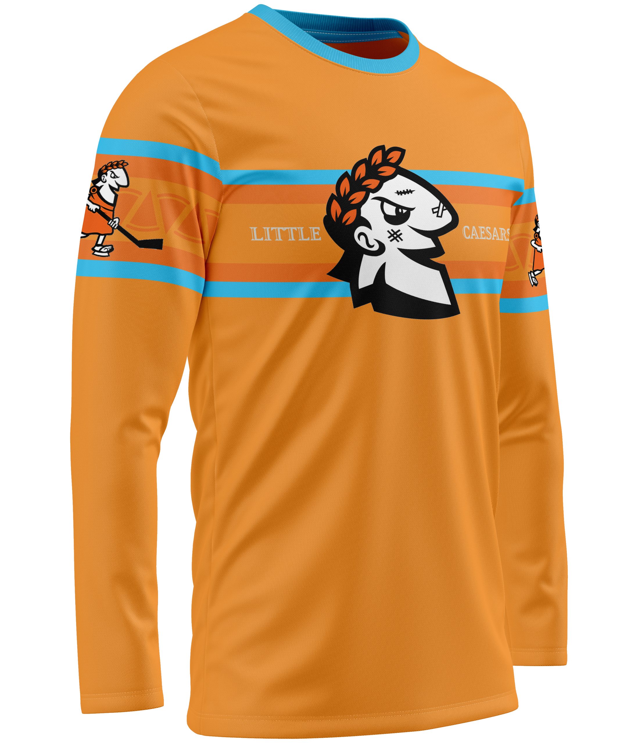
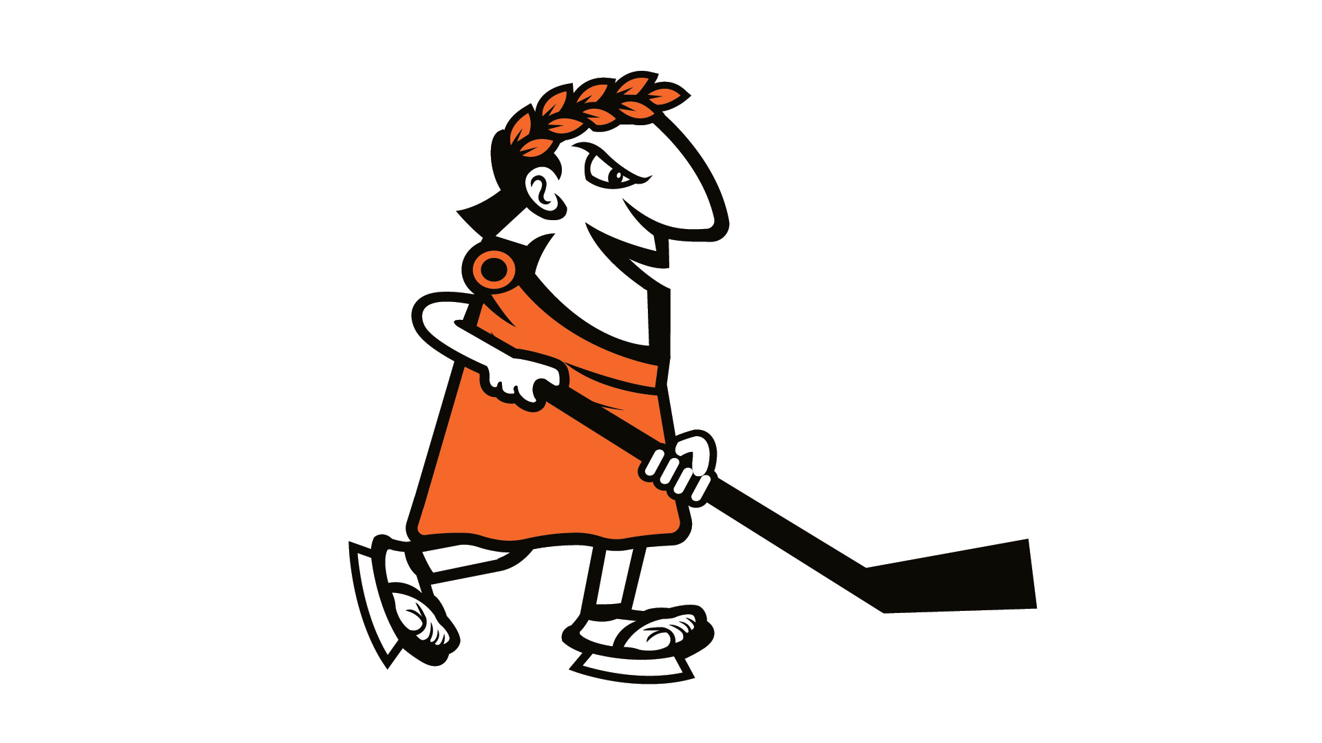
The primary mark reimagines the iconic Caesar mascot through a bold, hockey-focused lens. Designed in a college-style aesthetic, Caesar is shown in a more aggressive, game-ready stance holding a hockey stick instead of pizza. This version elevates the character into a competitive sports environment while maintaining strong ties to the original corporate identity.
Secondary Logo
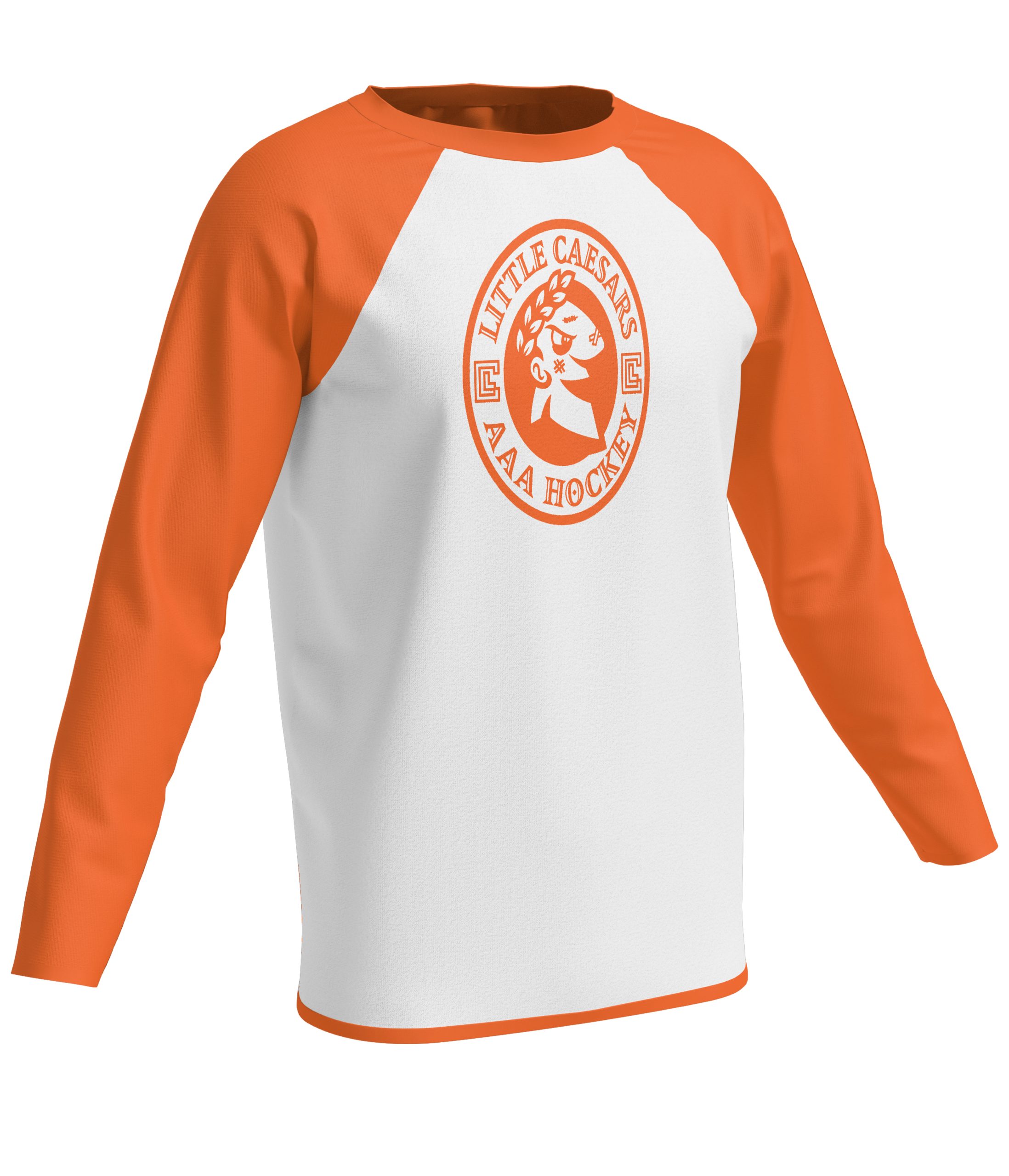
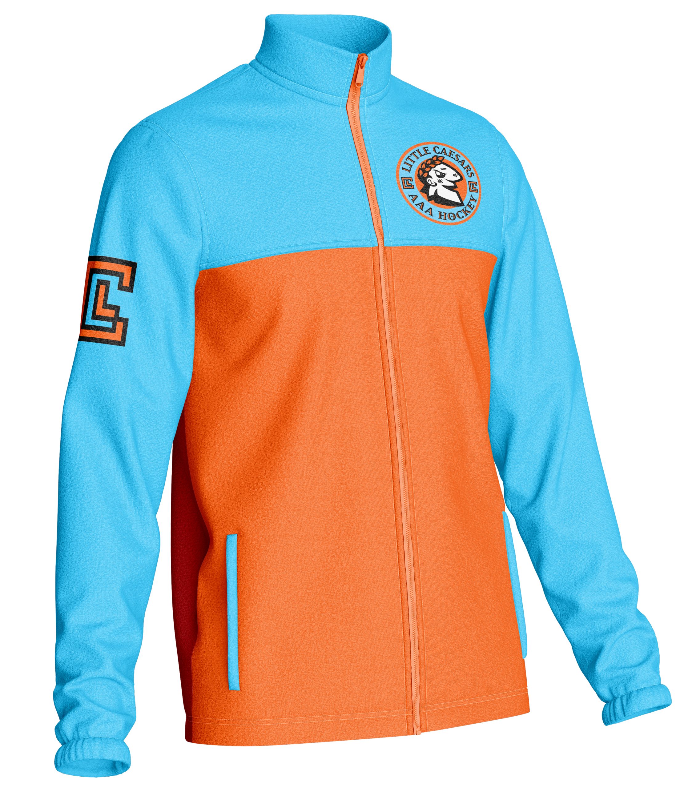
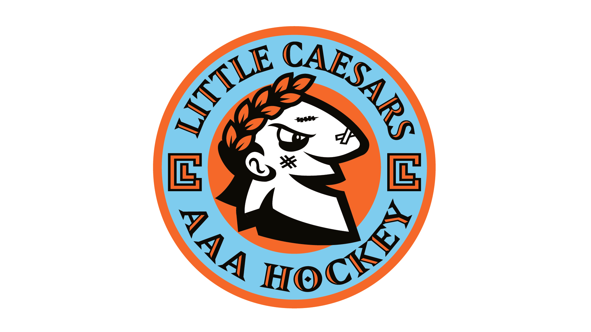
The secondary mark presents Caesar in a circular badge format with a post-game, battle-worn look. Featuring details like a black eye, stitches, and a tougher expression, this version highlights the grit and intensity of hockey. Surrounding typography uses a modern Greek-inspired style, paired with a custom “LC” box mark that adds a clean, recognizable brand abbreviation.
Caesar Head Logo (Tertiary Mark)
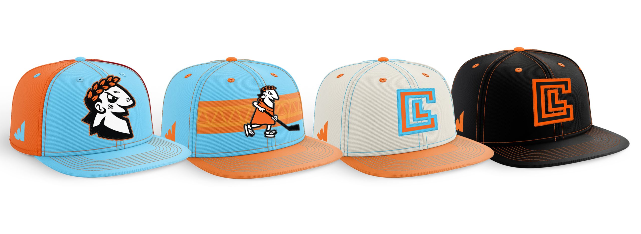
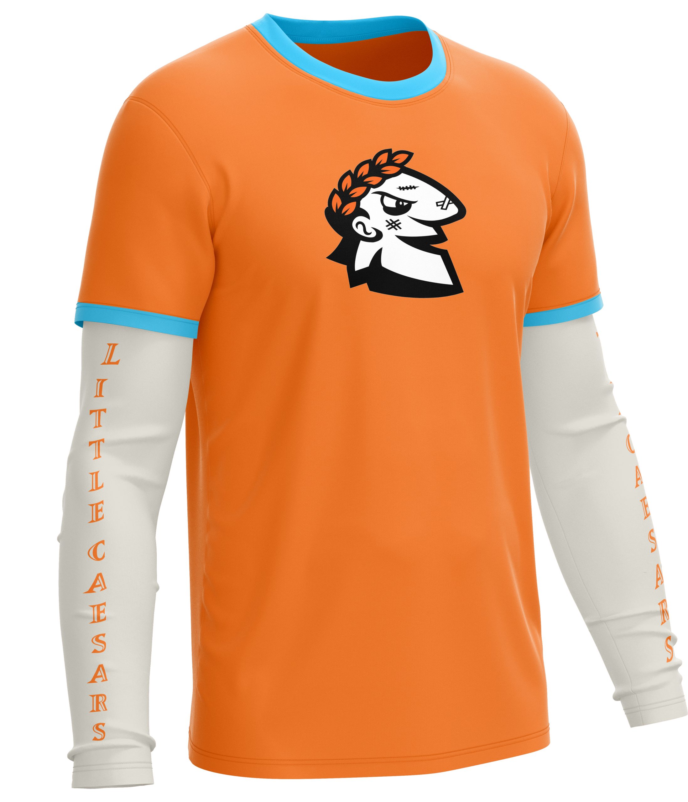
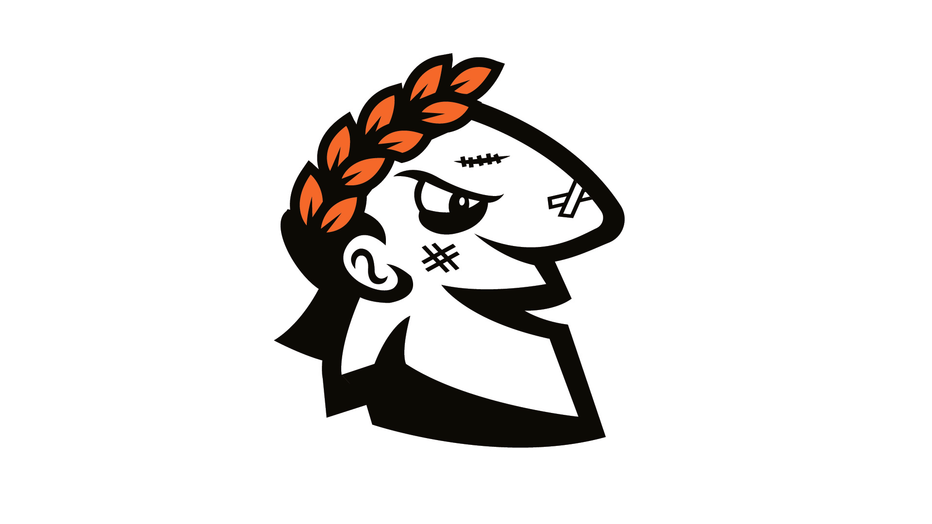
The tertiary mark simplifies the identity into a standalone Caesar head designed for maximum versatility. With a fierce, battle-tested expression, this logo functions as a strong accent mark for helmets, apparel, and branding applications. It maintains the core personality of the mascot while offering a clean and flexible graphic for everyday use.
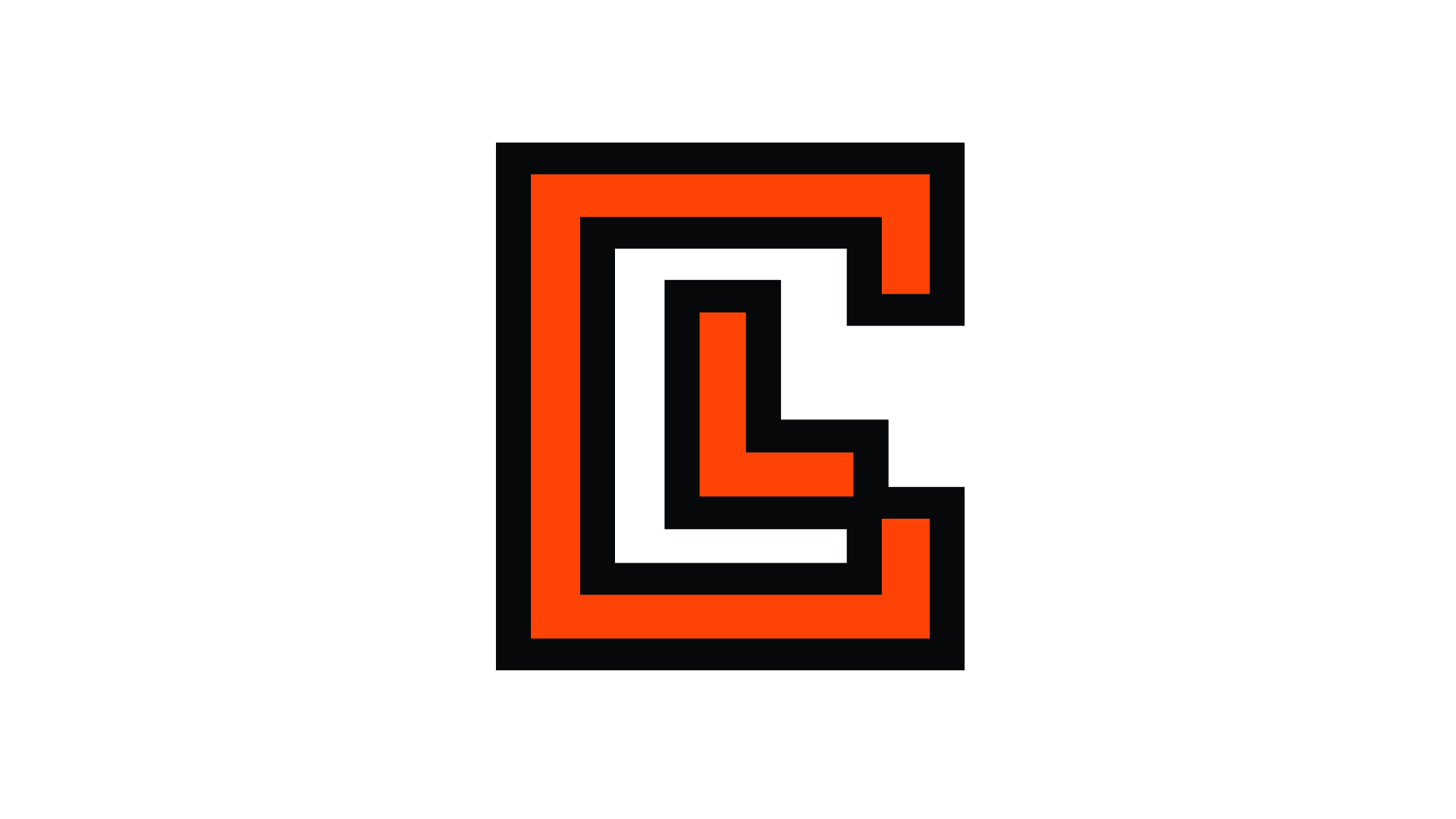
LC Box Logo (Supporting Mark)
The LC Box Logo is a clean, modern abbreviation mark created to represent Little Caesars in a simplified and highly versatile form. Built around a structured box composition, the design frames the letters “LC” in a bold, balanced layout that reinforces instant brand recognition through minimal form and strong geometry. The typography and subtle detailing are influenced by a Caesar and Greek-inspired aesthetic, giving the mark a classic, historical edge while still feeling modern and athletic in execution.
Designed for flexibility, this mark functions as a compact branding element across apparel, merchandise, and small-scale applications where the full mascot cannot be used. The bold framing, cultural styling, and simplified structure create a strong visual presence while maintaining a direct connection to the larger Caesar identity system, making it a refined and adaptable extension of the brand.