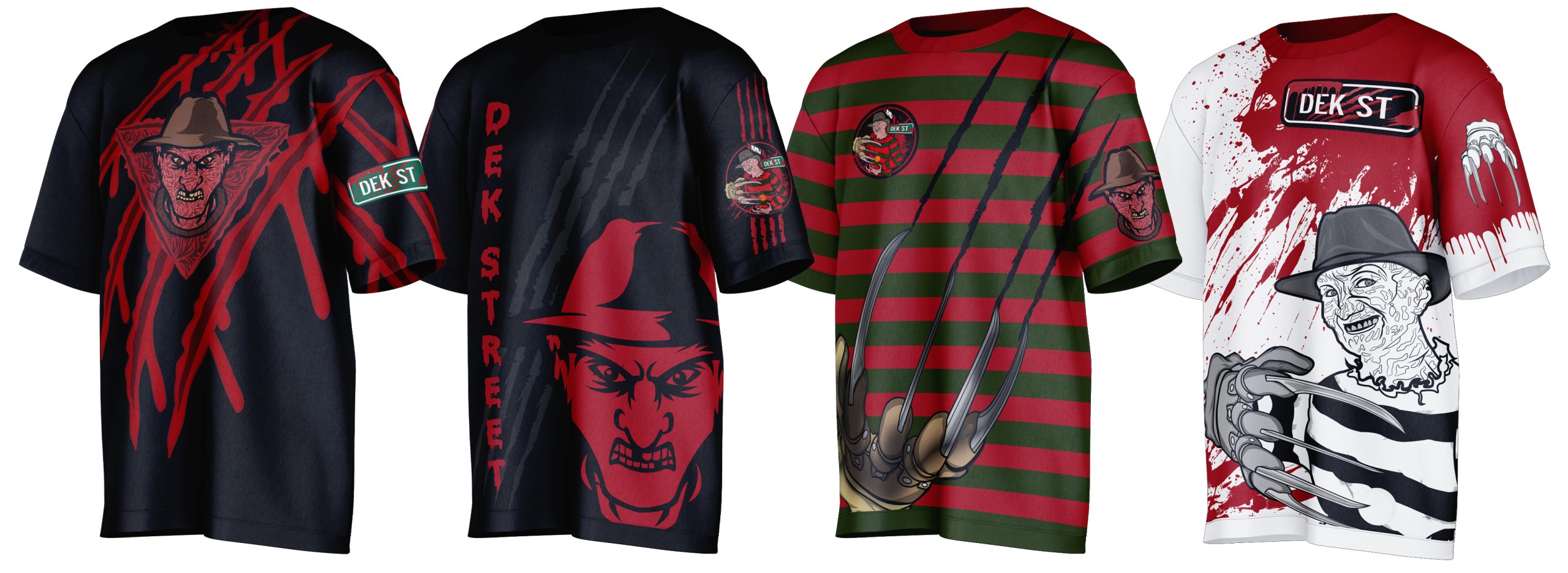
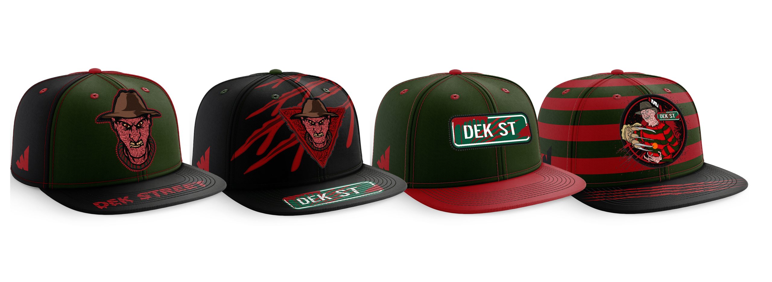
DEK STREET HOCKEY
Nightmare on Dek Street was a creative identity project developed for a floor/street hockey team based in Iowa. The team came forward with a bold concept inspired by the Freddy Krueger universe and Nightmare on Elm Street, looking to translate that horror-driven theme into a unique hockey brand. The goal was to build a full visual identity that felt dark, memorable, and connected to the intensity of their style of play.
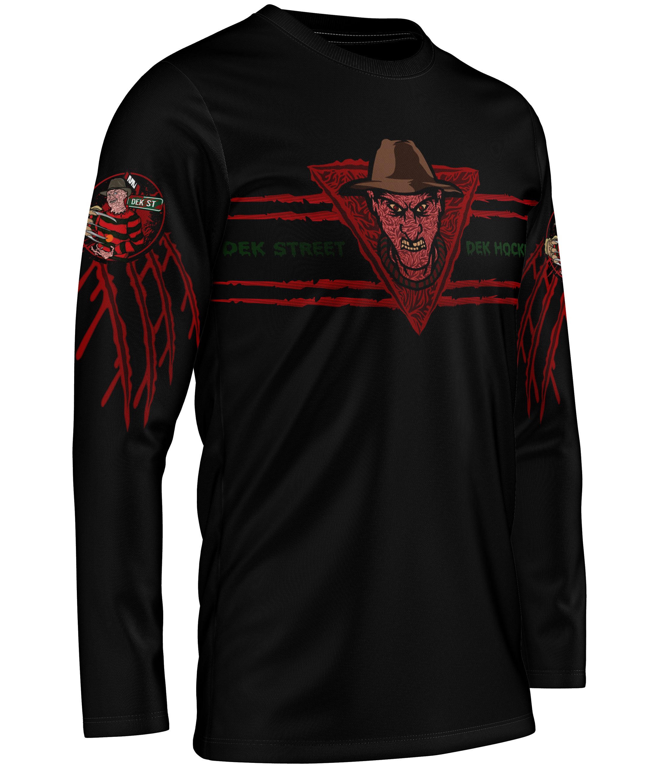
Across the project, the Freddy Krueger influence became the foundation for a multi-logo system designed specifically for the team’s name, culture, and league environment.



BRAND MARKS

Primary Mark
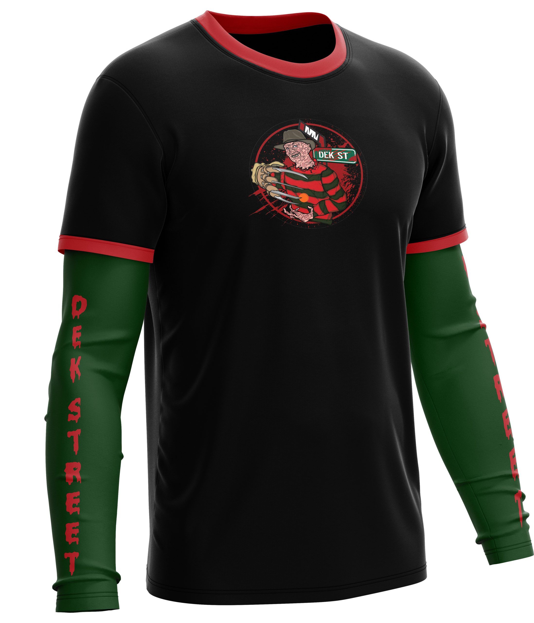
The primary mark reimagines Freddy Krueger through a bold, hockey-focused lens for the Dek Street identity. Designed with an aggressive, action-driven approach, Freddy is shown in a dynamic pose holding his signature glove while interacting with a hockey ball. This version pushes the character into a sports environment while staying true to the horror-inspired roots of the concept and the team’s dark identity.


Secondary Mark
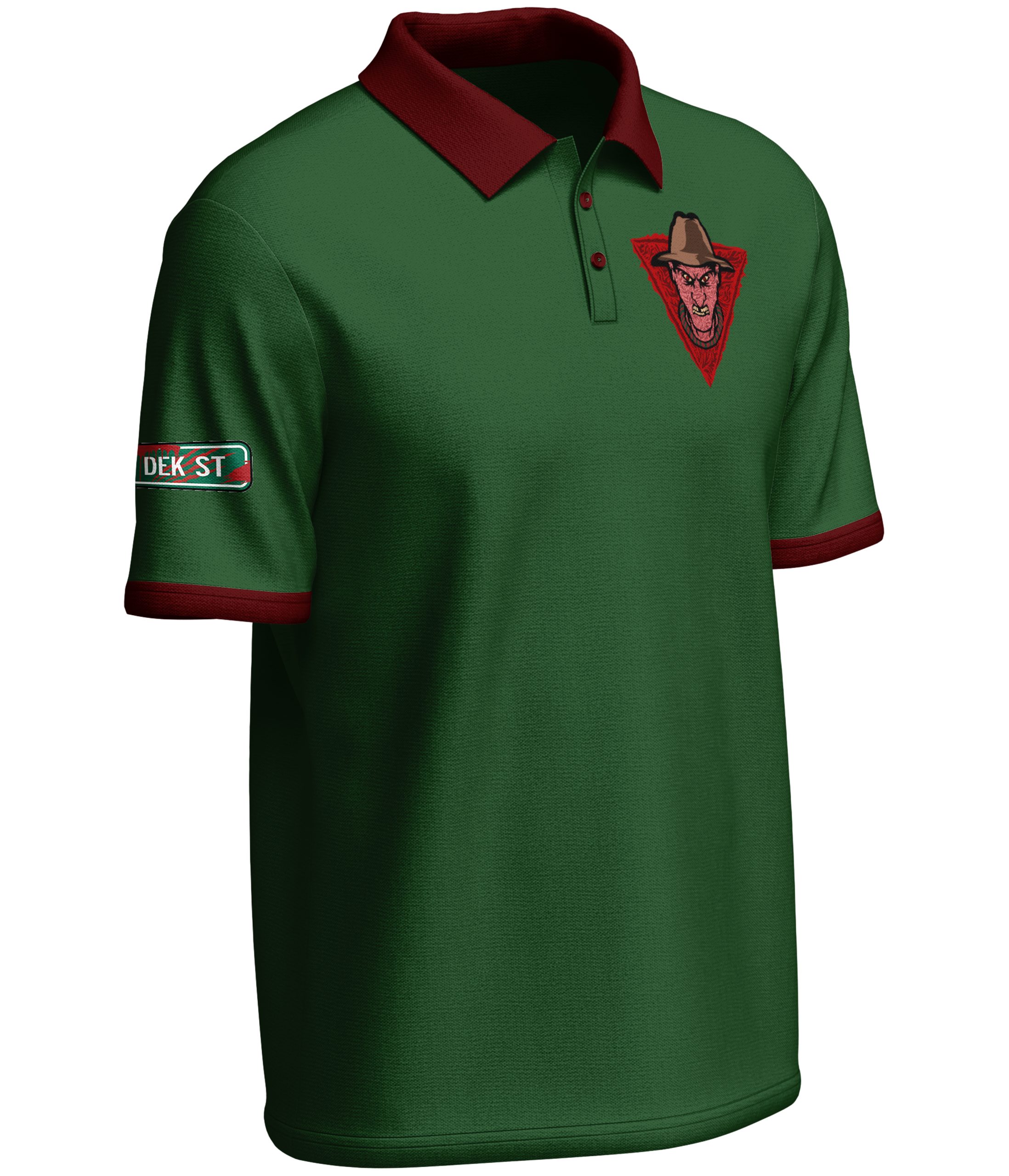
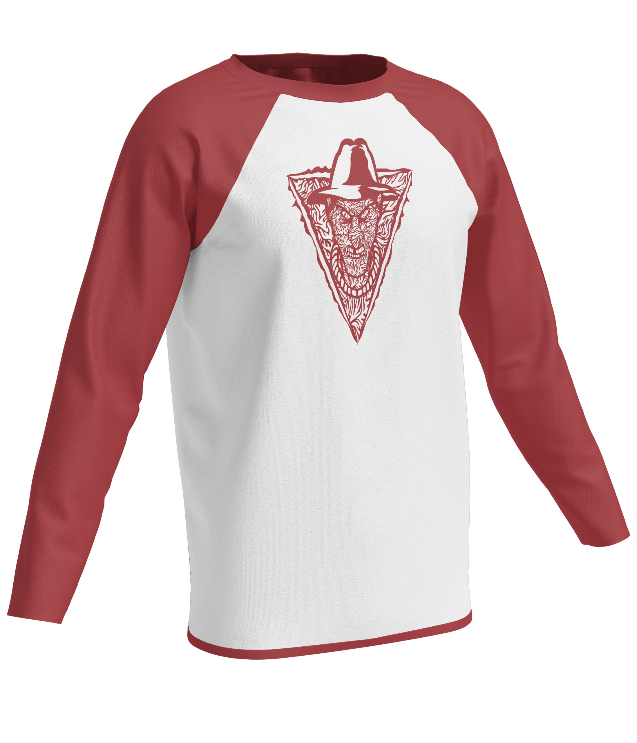
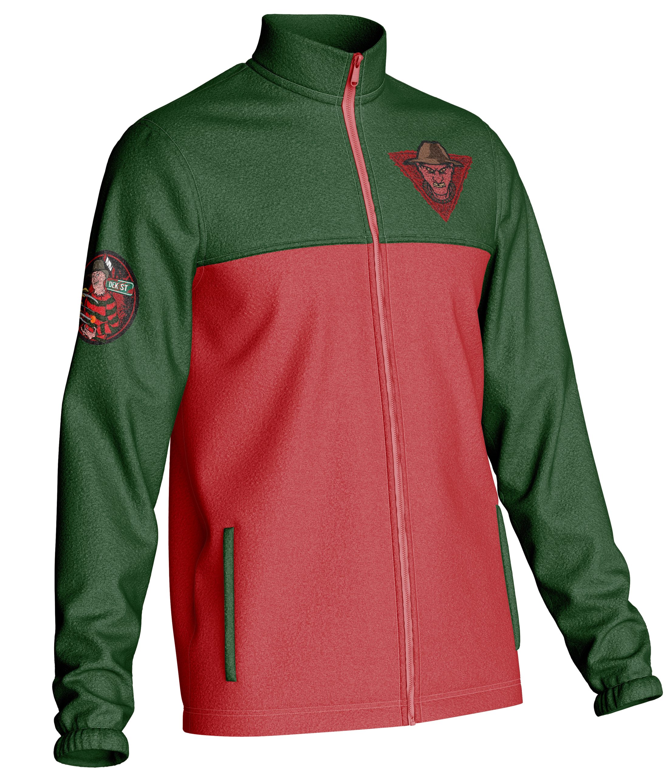
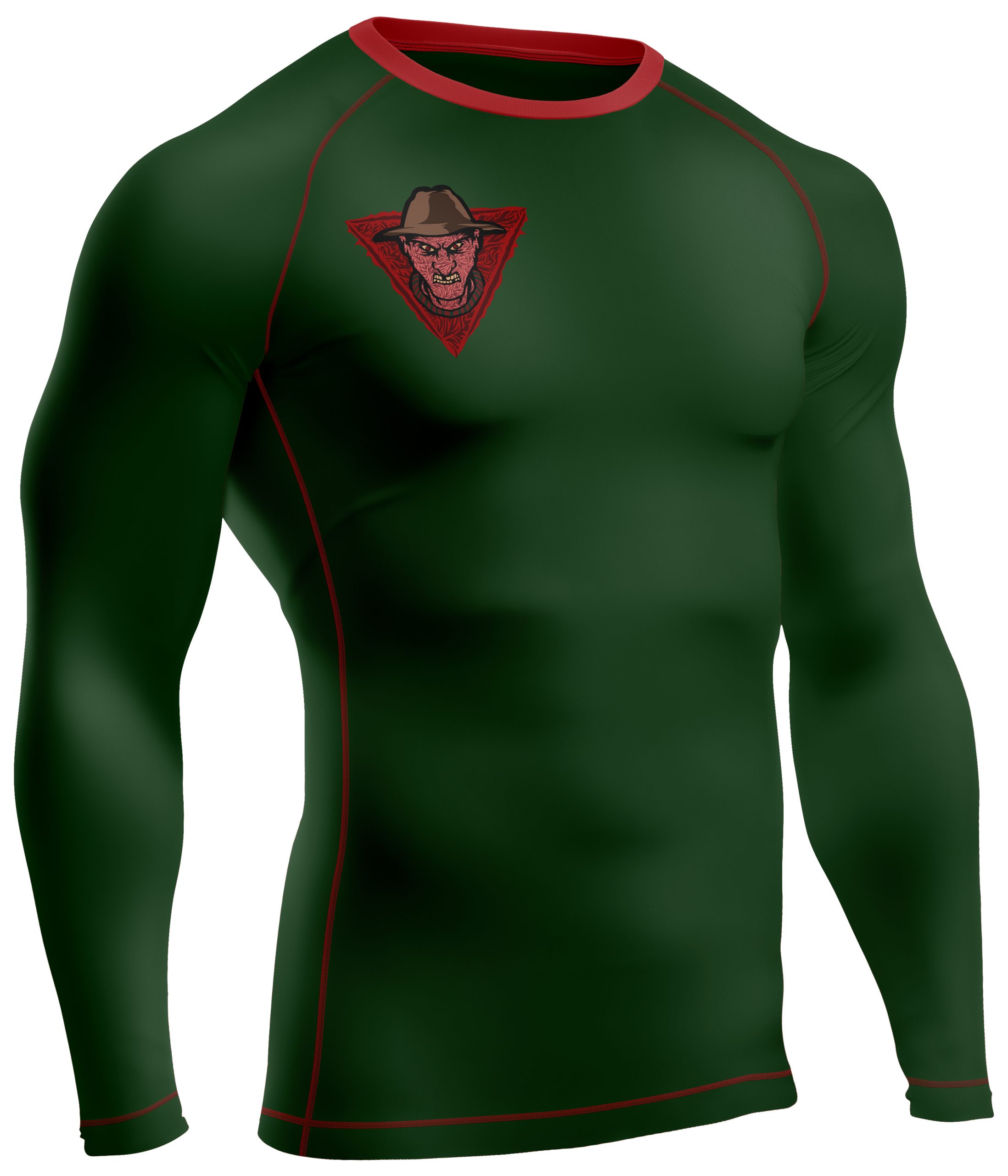
The secondary mark focuses on a more graphic, stylized interpretation of Freddy Krueger’s face. Built with a burned-skin texture and placed within a torn, angular shape, the design creates a gritty and aggressive visual tone. Details like a missing tooth were added to connect the character to the toughness and physicality of hockey, reinforcing the violent energy of the brand.
Supporting Mark
The secondary mark focuses on a more graphic, stylized interpretation of Freddy Krueger’s face. Built with a burned-skin texture and placed within a torn, angular shape, the design creates a gritty and aggressive visual tone. Details like a missing tooth were added to connect the character to the toughness and physicality of hockey, reinforcing the violent energy of the brand.


Supportive Mark
The secondary mark focuses on a more graphic, stylized interpretation of Freddy Krueger’s face. Built with a burned-skin texture and placed within a torn, angular shape, the design creates a gritty and aggressive visual tone. Details like a missing tooth were added to connect the character to the toughness and physicality of hockey, reinforcing the violent energy of the brand.