CHICAGO POLICE STARS
When I started working with the Chicago Police Stars I was honored and energized when the opportunity came to collaborate with the the non for profit hockey Team—a program built on discipline, pride, and a deep-rooted commitment to community. Projects like this carry a unique weight; they’re not just about creating a visual identity, but about capturing the spirit of those who represent something bigger than the game itself.




BRAND MARKS
Primary Mark
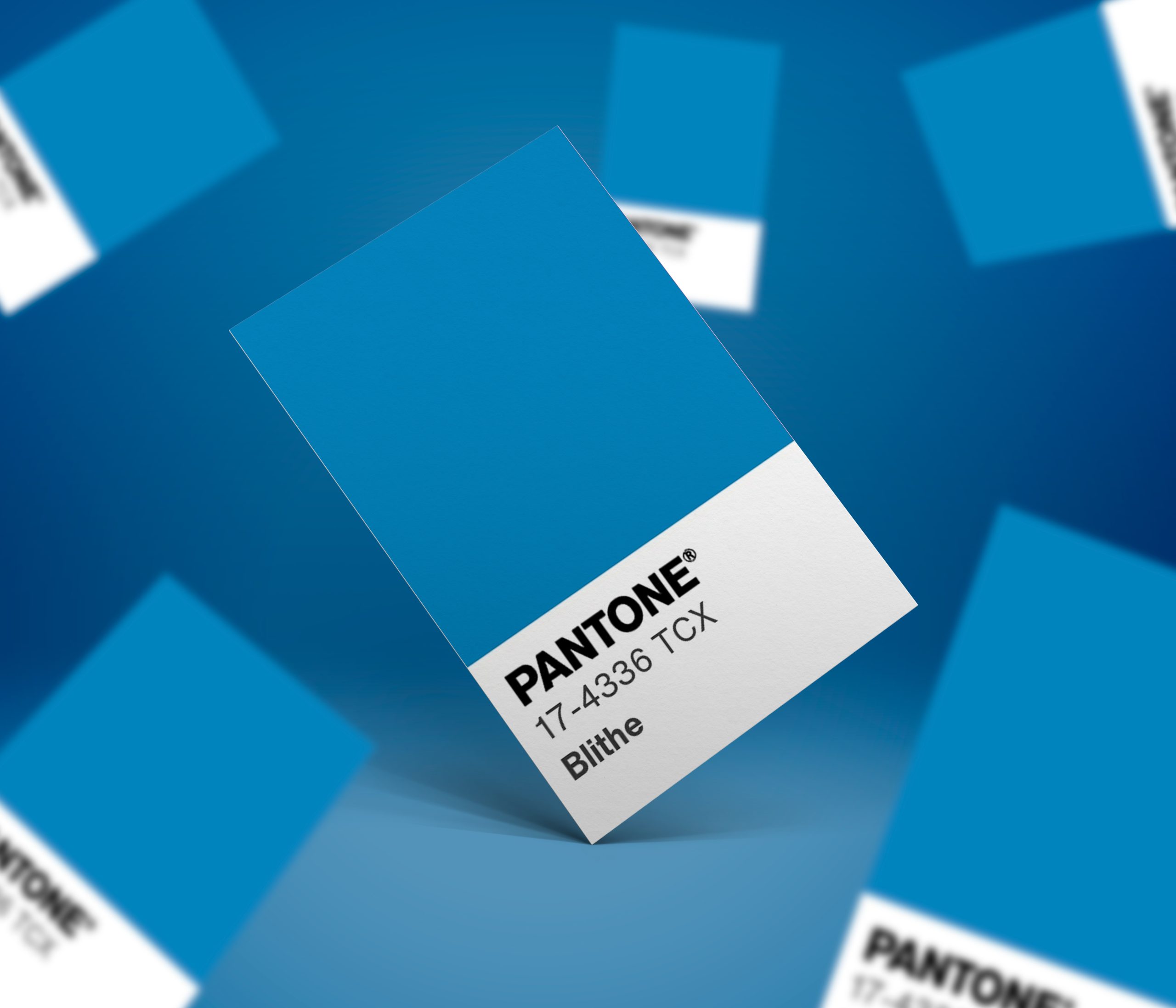
The primary mark was designed to create a stronger and more recognizable identity for the Chicago Police Stars while honoring the organization’s deep connection to the city of Chicago. Inspired by the Chicago Red Stars, the design centers around a bold “C” mark paired with a police-blue color palette to immediately connect the brand to both the department and the city.
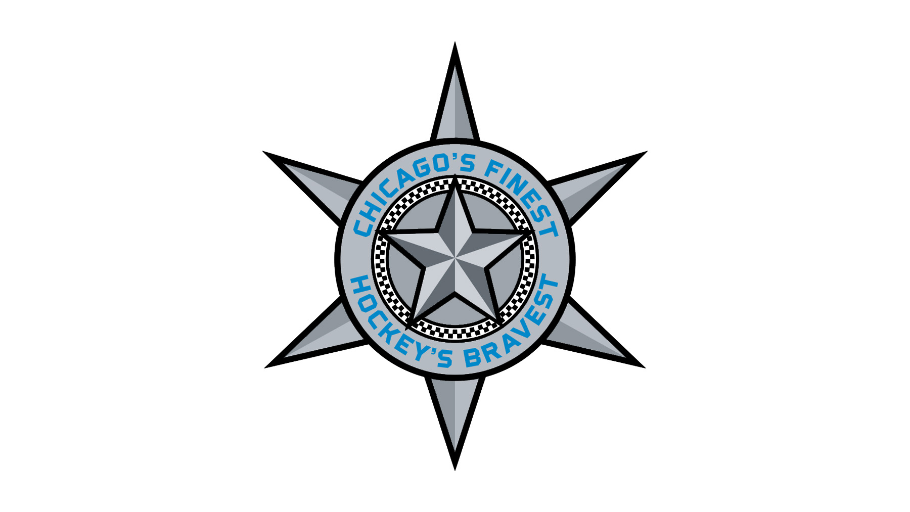
At the core of the design is the iconic Chicago star, integrated alongside a blue line element inspired by the symbolism of the police flag. Together, these elements create a modern athletic identity that balances professionalism, city pride, and respect for law enforcement heritage.

Secondary Mark
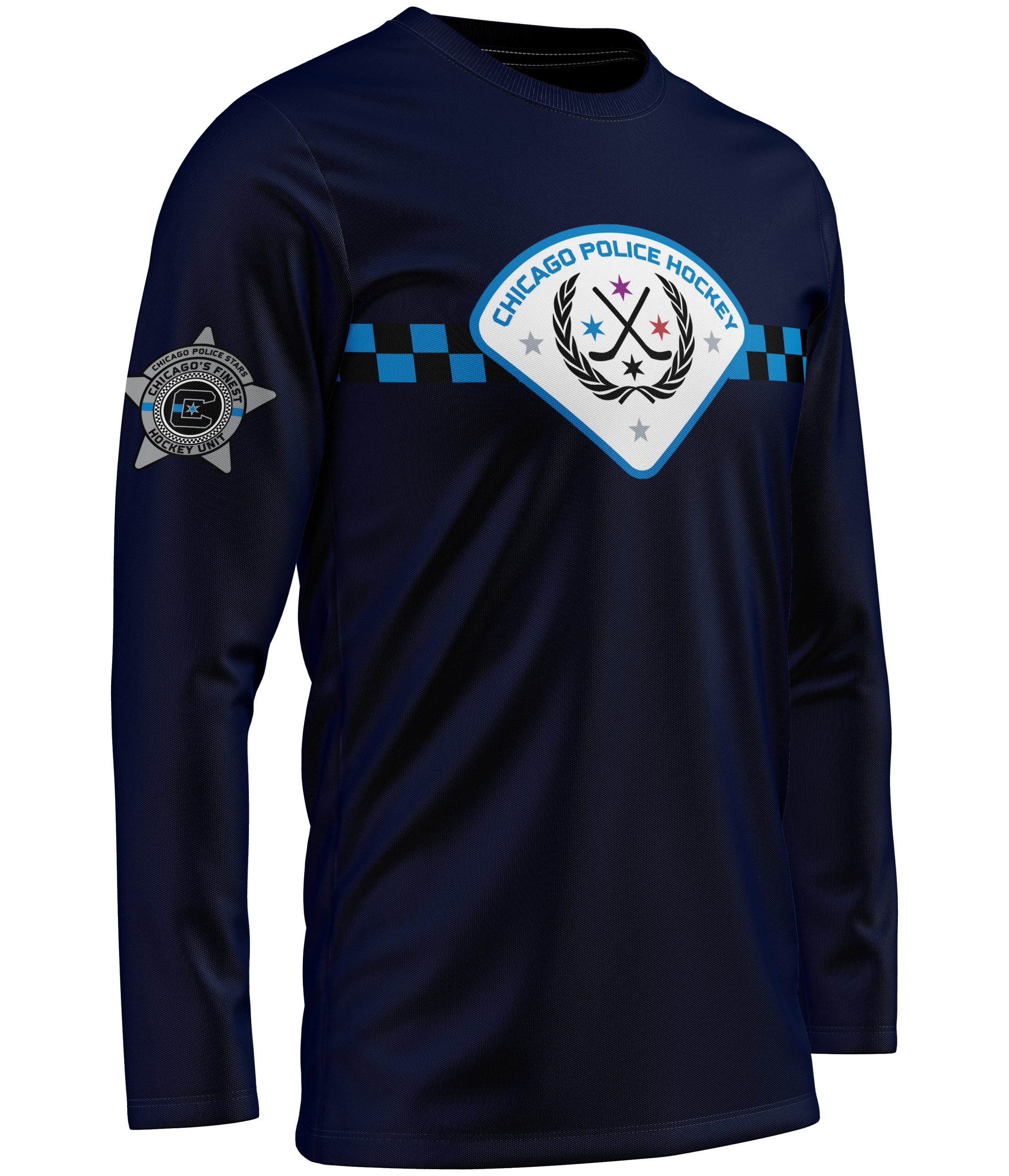
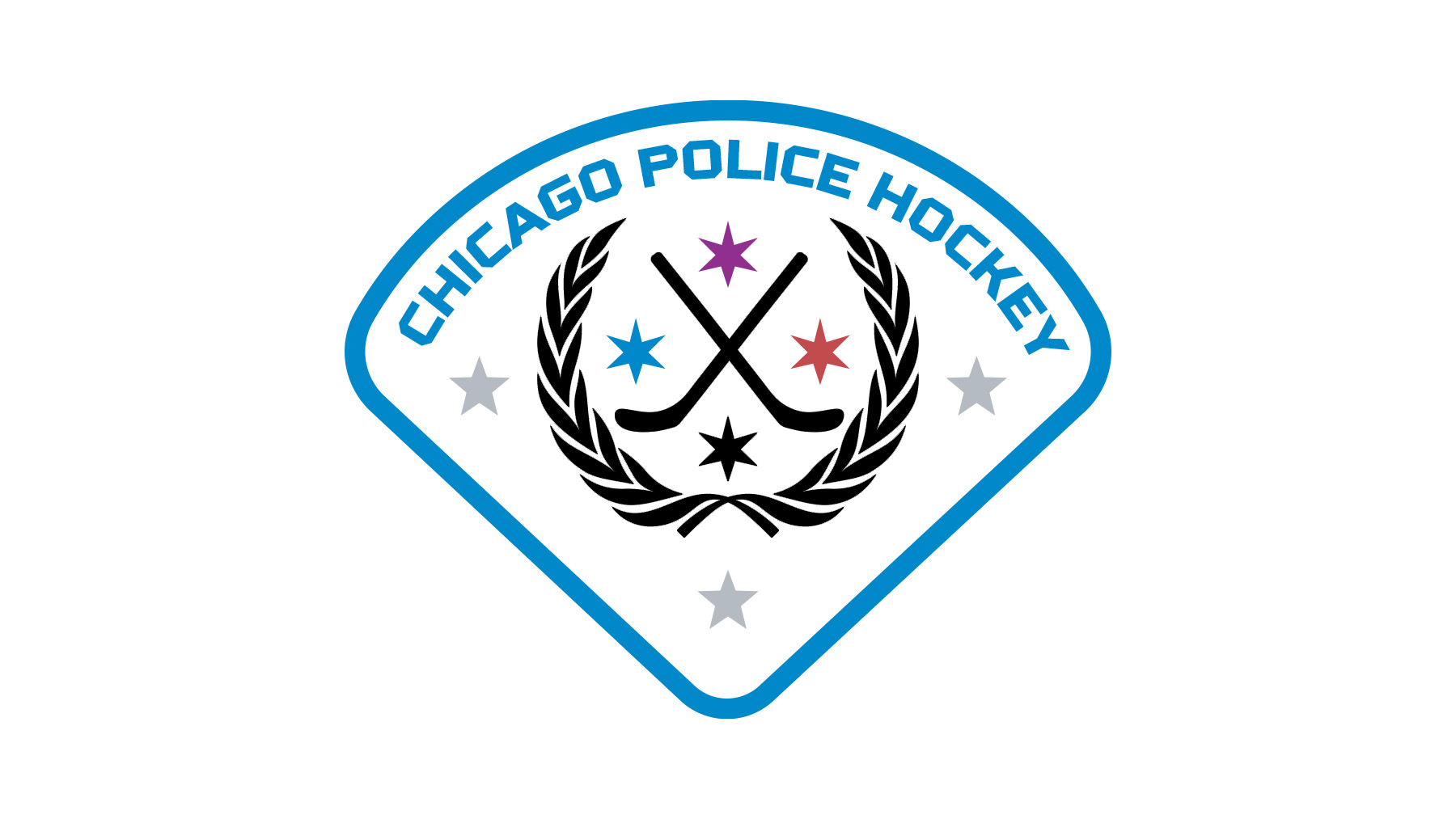
The secondary mark takes a more heritage-driven approach, inspired by the historic triangular commemorative patch once worn by the Chicago Police Department. Reimagined through a hockey lens, the design references the department’s commemorative shield used between 1960 and 1981 while modernizing it for a sports identity system.
Three stars are incorporated to represent the first three police precincts established in Chicago in 1855, while the color palette of purple, red, blue, and black symbolizes sacrifice, injury, service, and fallen officers. A laurel wreath reinforces the commemorative aspect of the design, symbolizing honor and remembrance. Crossed black hockey sticks complete the identity, grounding the mark within the sport while respectfully tying together hockey and police service.
Commemorative (Supporting Mark)
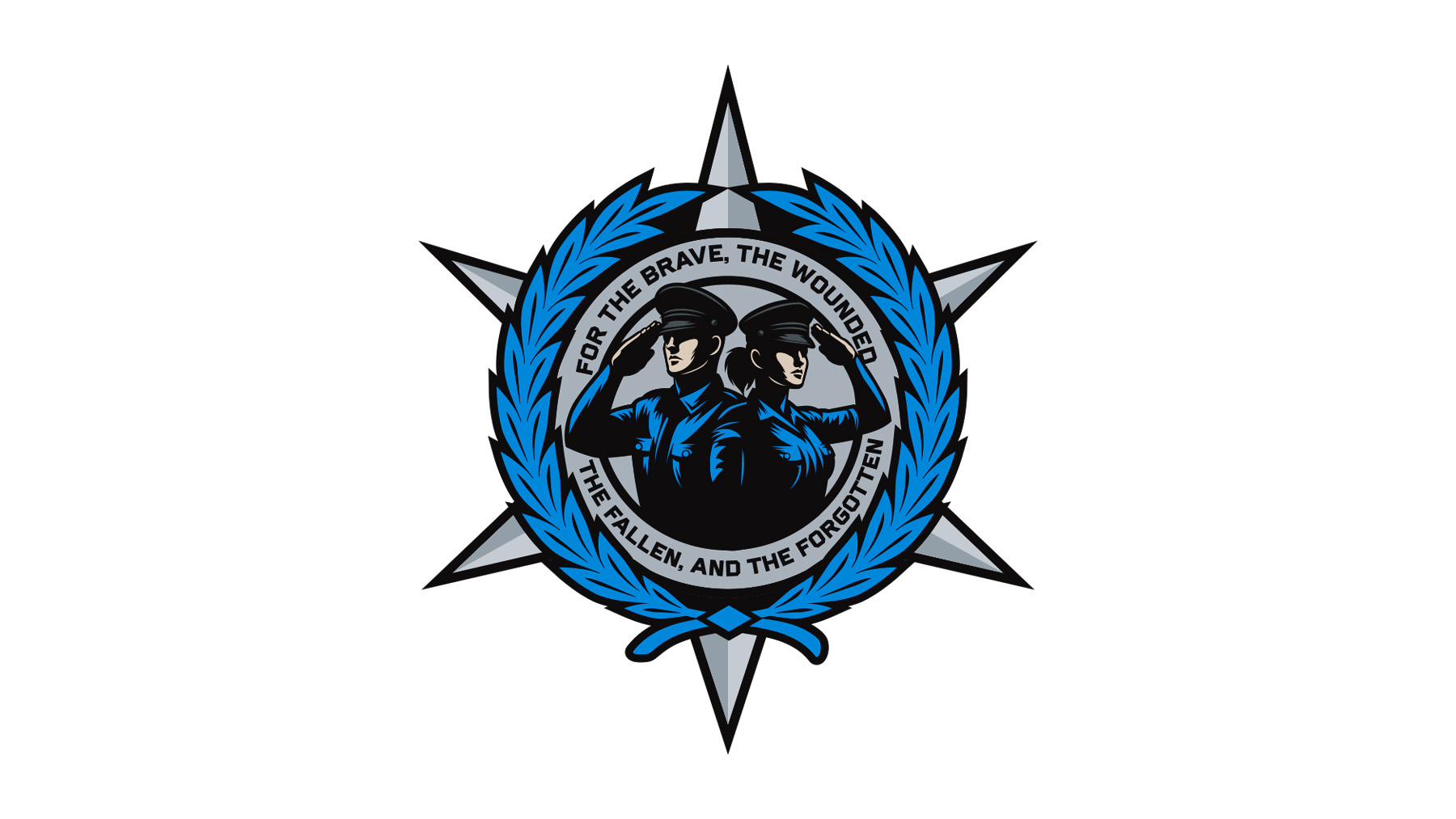
One of the supporting marks was created as a commemorative emblem dedicated to the officers who served and sacrificed for the city of Chicago. Encircling the design are the words: “For the Brave, the Wounded, the Fallen, and the Forgotten,” reinforcing the logo’s tribute-driven purpose.
A royal blue laurel wreath frames the composition, symbolizing unity, remembrance, and honor. At the center, a beveled Chicago star strengthens the connection to the department, while two saluting officers—one male and one female—serve as a tribute to the men and women who dedicated their lives to service.