CHICAGO MISSION AAA HOCKEY




The Identity
The Chicago Mission Winter Classic identity was built to feel bold, unified, and rooted in Chicago hockey culture. The system combines a fierce mascot-driven approach with strong city symbolism to create a brand that feels competitive and authentic. Every element was designed to reflect pride, intensity, and tradition while still feeling modern and adaptable for a special event setting.
BRAND MARKS
Primary Mark
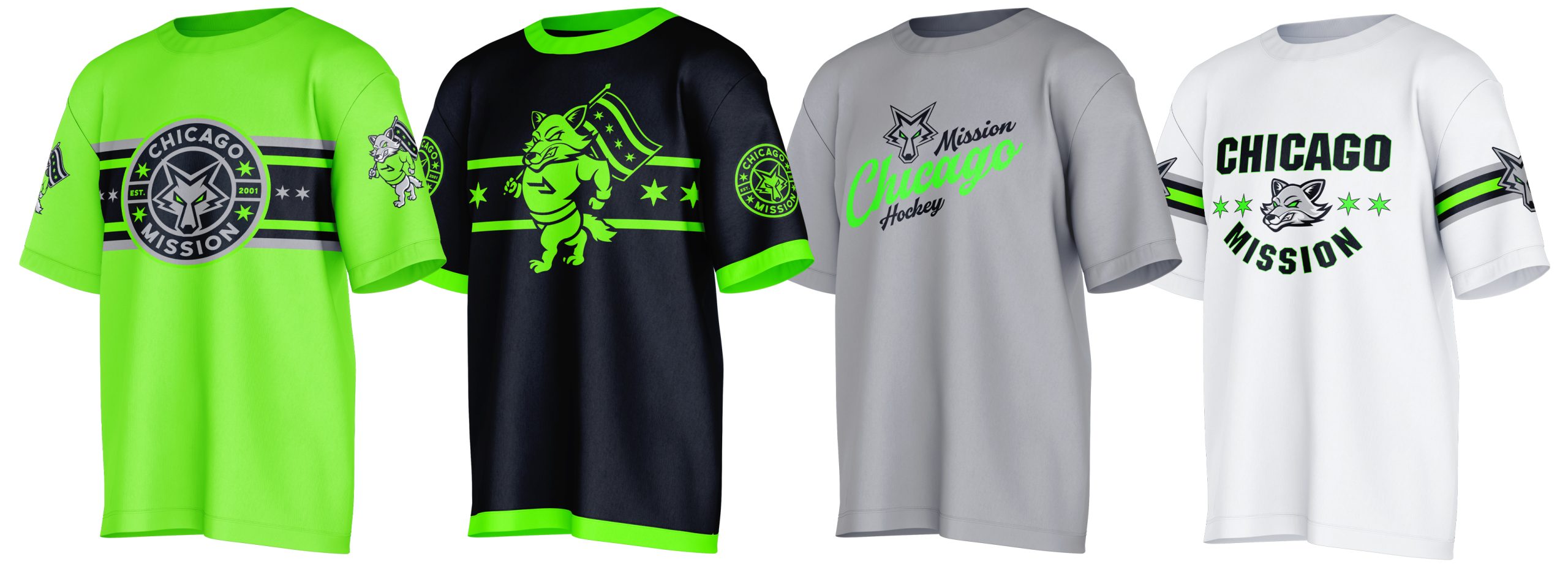
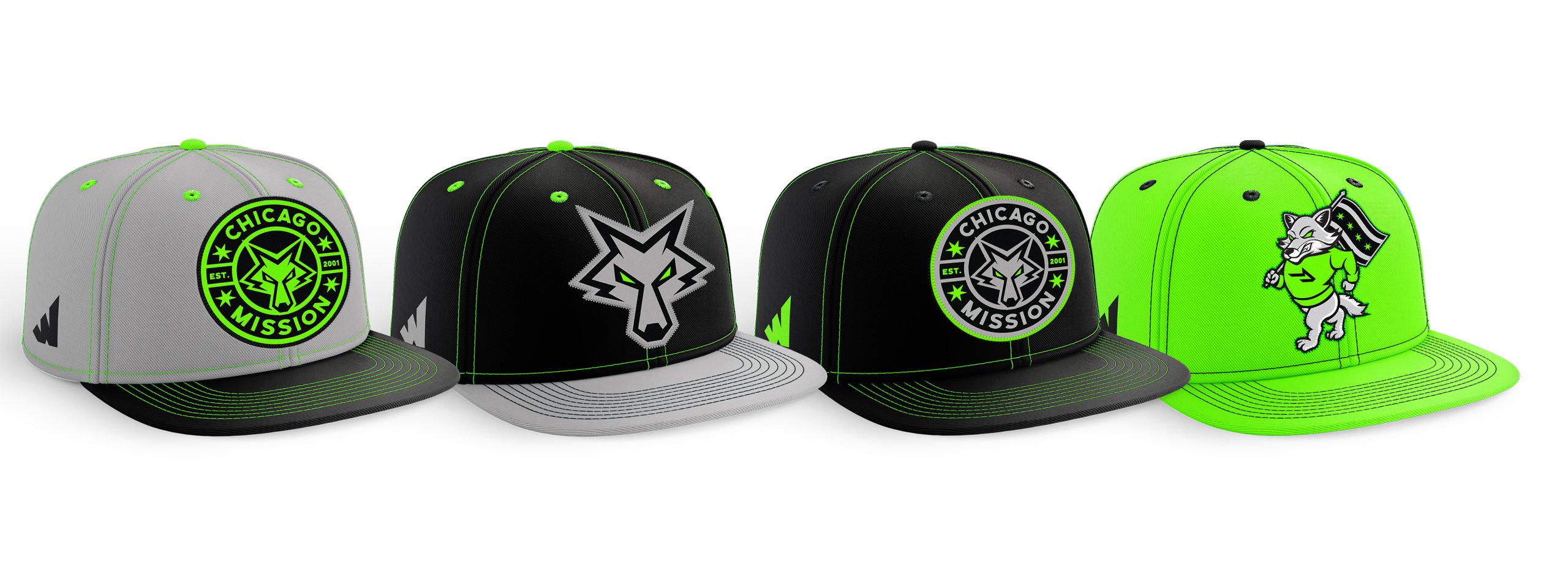
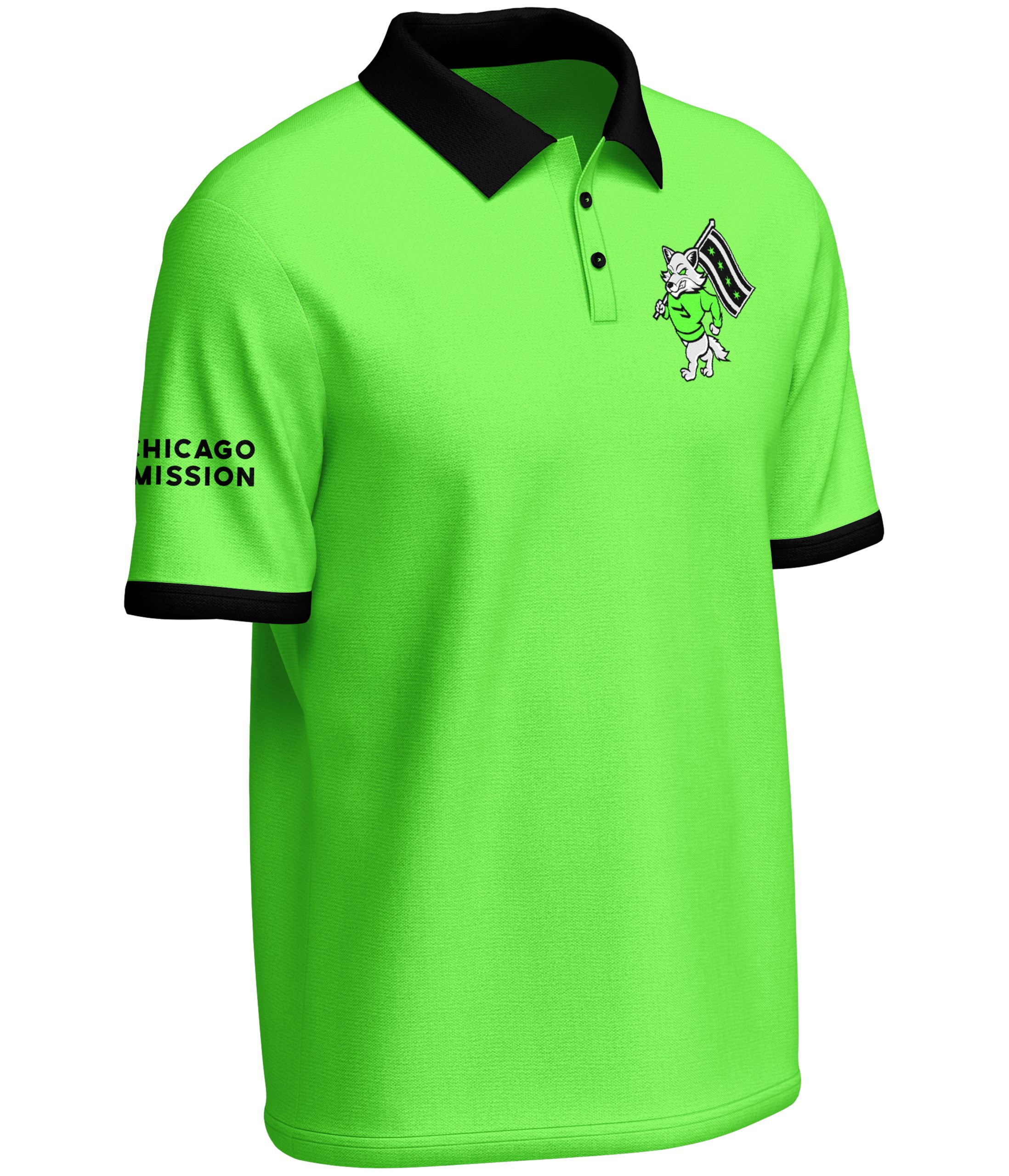
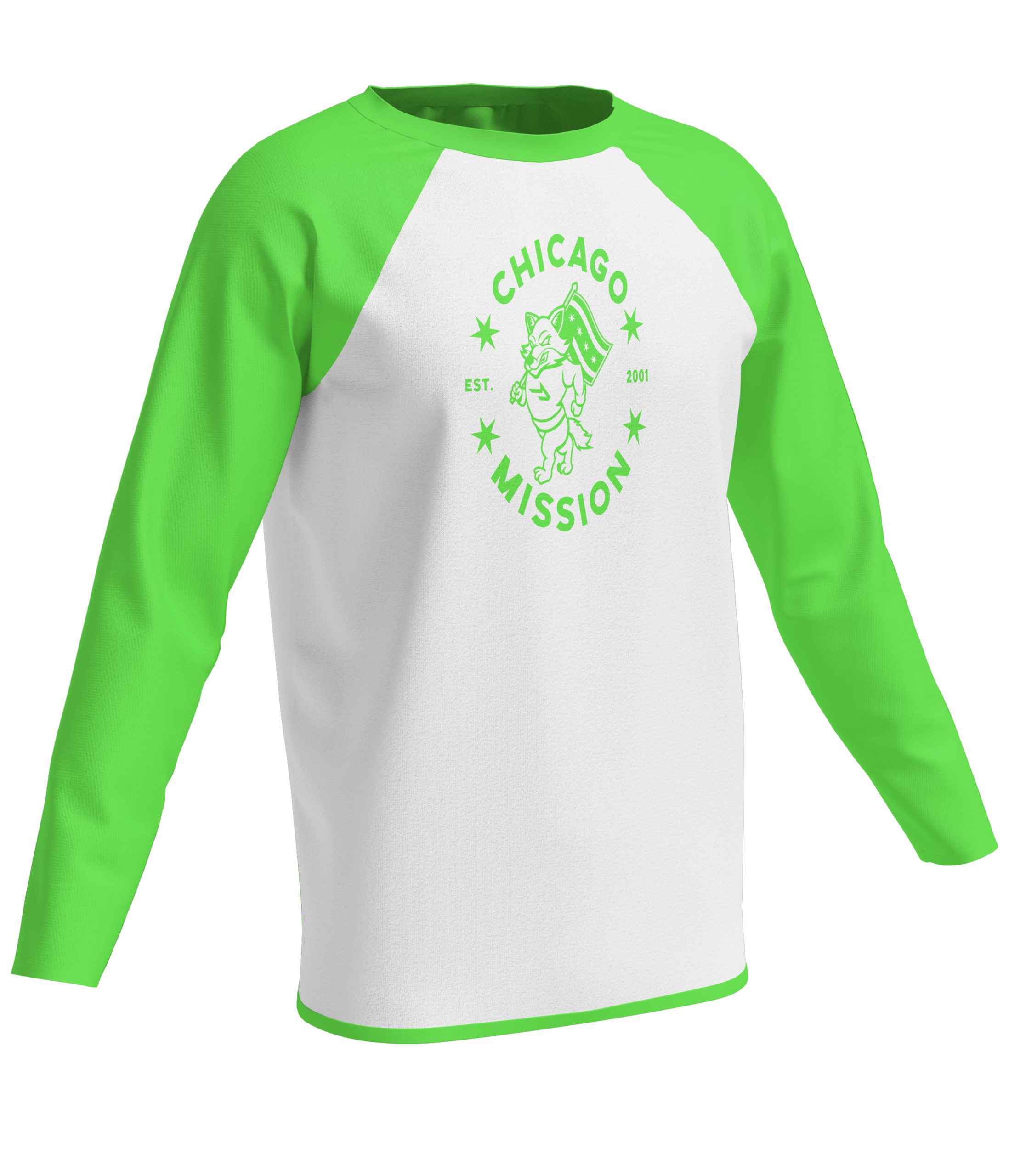
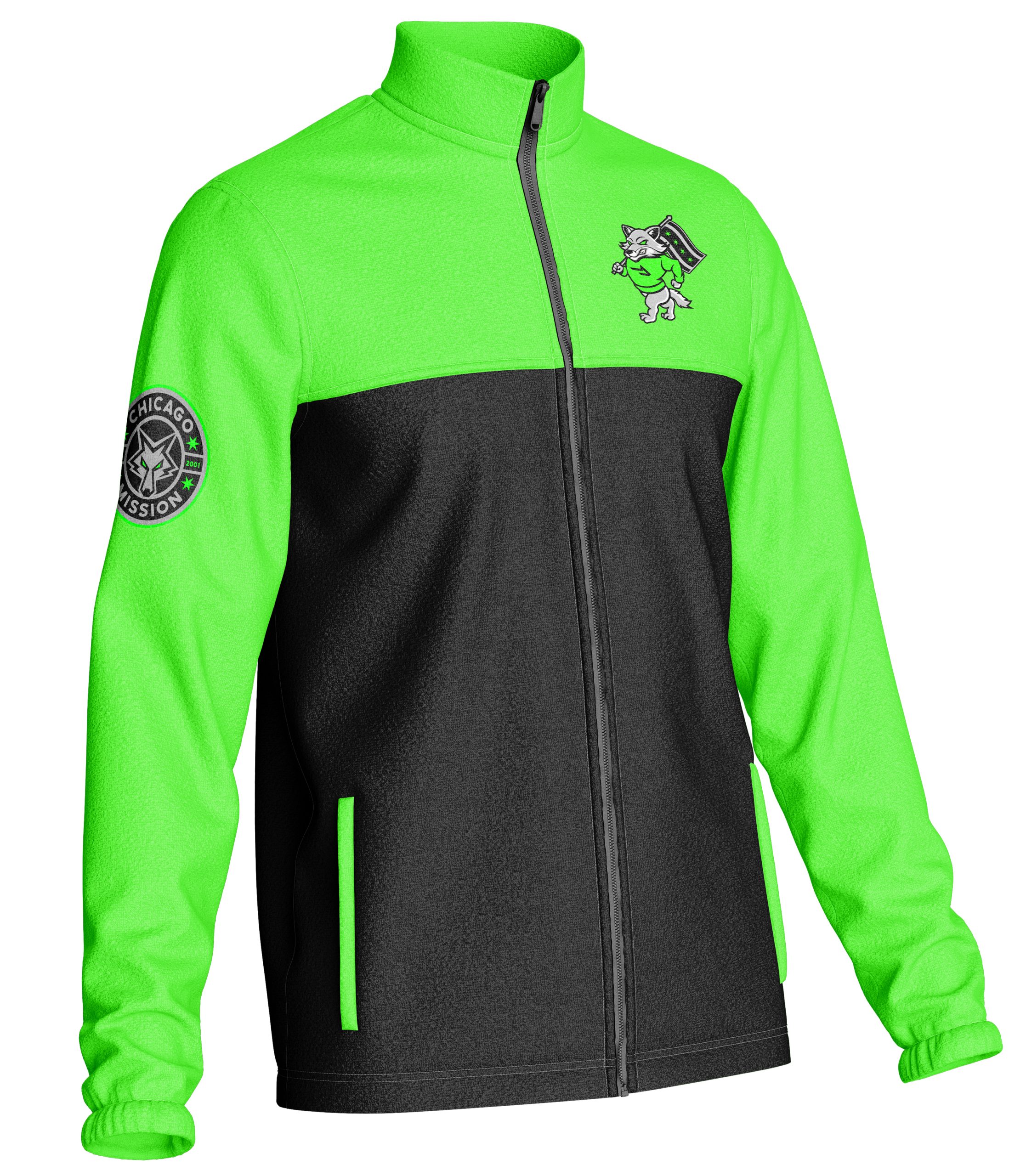
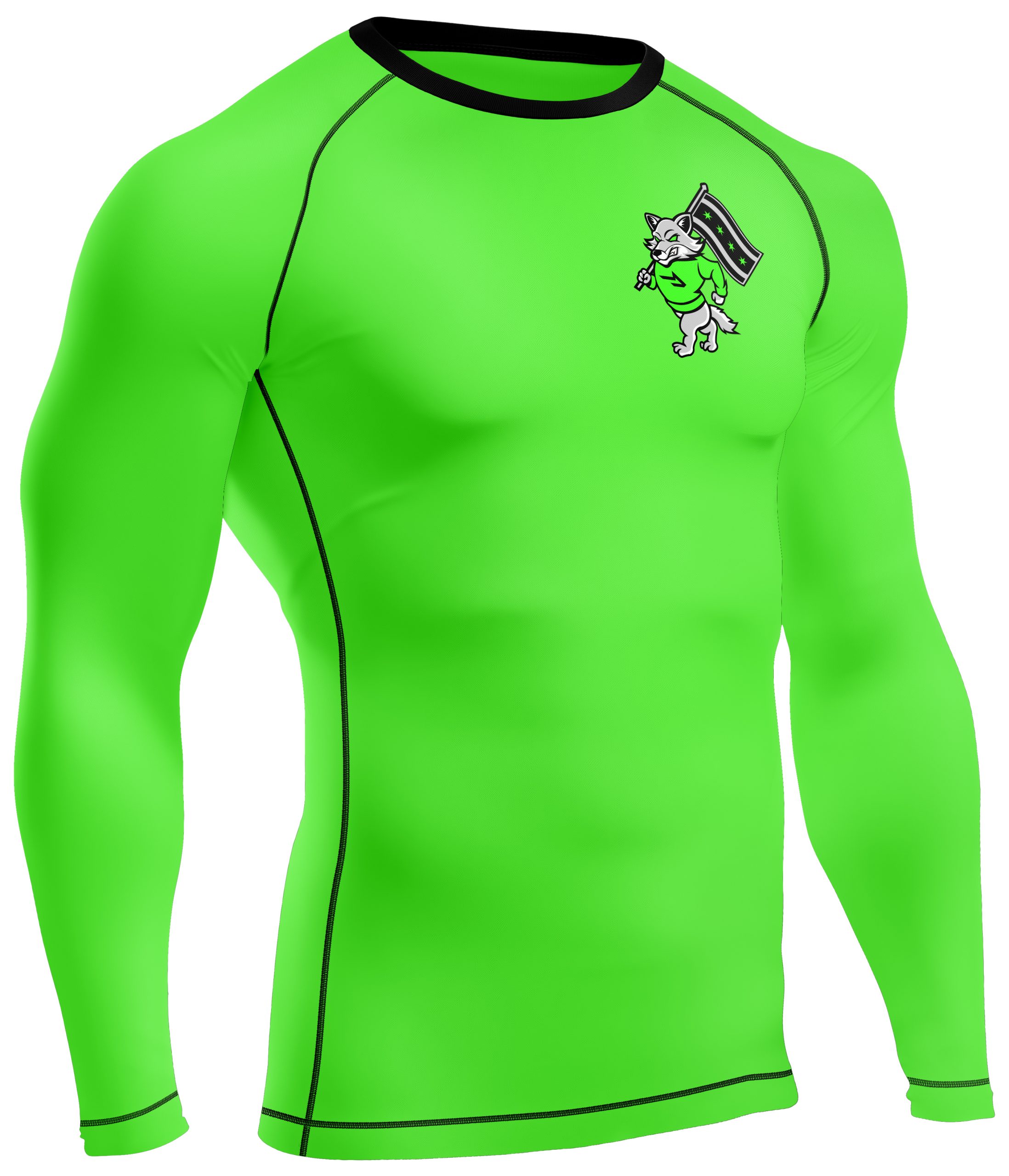
The primary mark features a fierce, college-style coyote mascot carrying the Chicago flag. This design was created to represent grit, toughness, and strong city identity. The expression and green eyes give the mascot an intimidating presence, while the Chicago flag anchors the design in hometown pride.

Secondary Mark
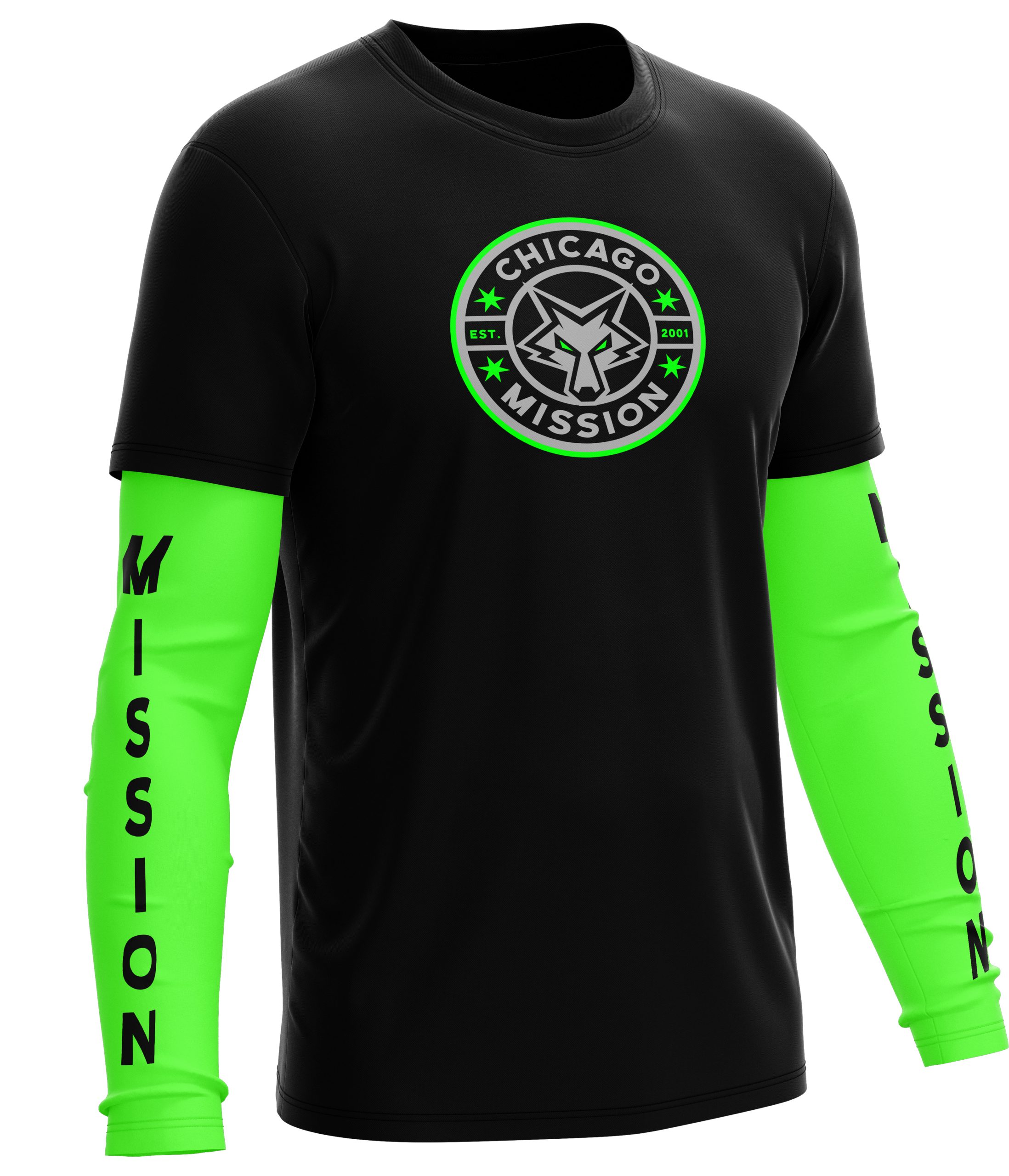
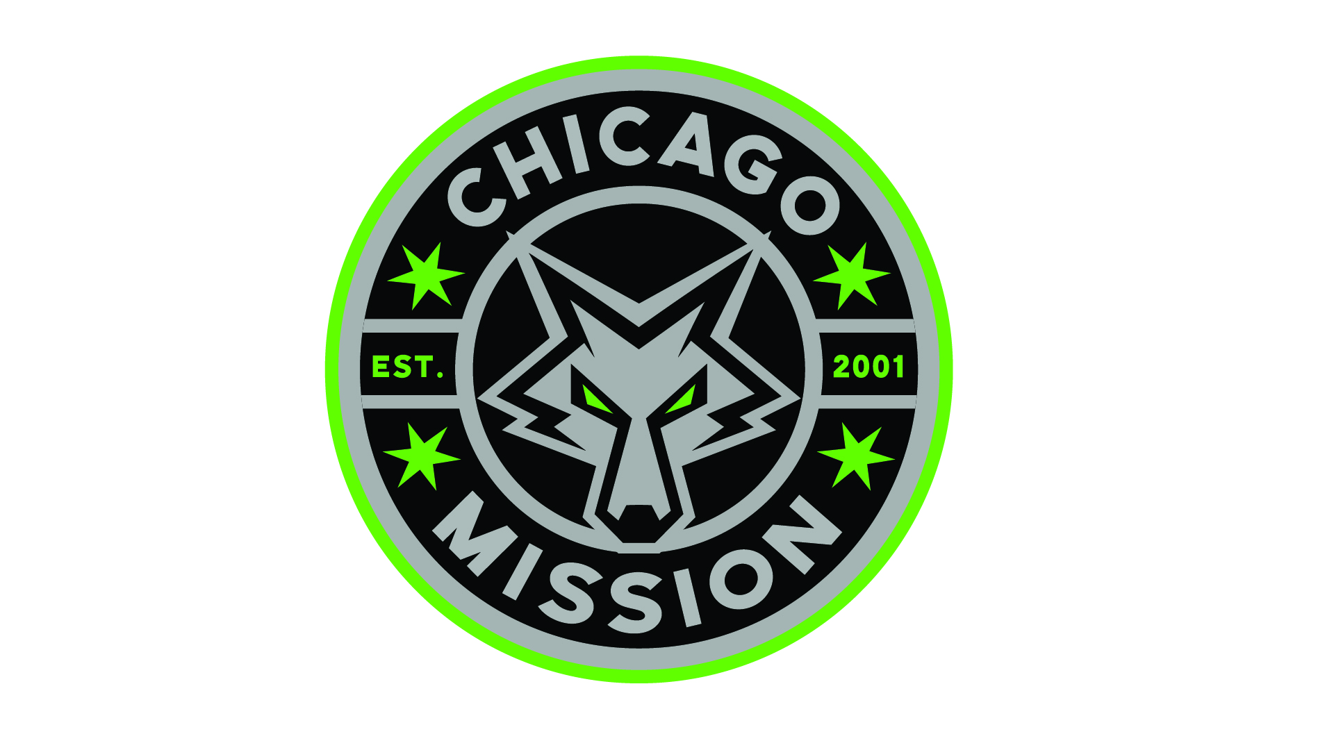
The secondary mark is built around a circular badge featuring a refined coyote head. The ears subtly form an “M,” tying directly back to the Mission identity. Four Chicago stars and “Est. 2001” reinforce the team’s roots, while a Chicago-inspired type style connects the design to the city’s visual culture.
“M” Coyote Head Mark
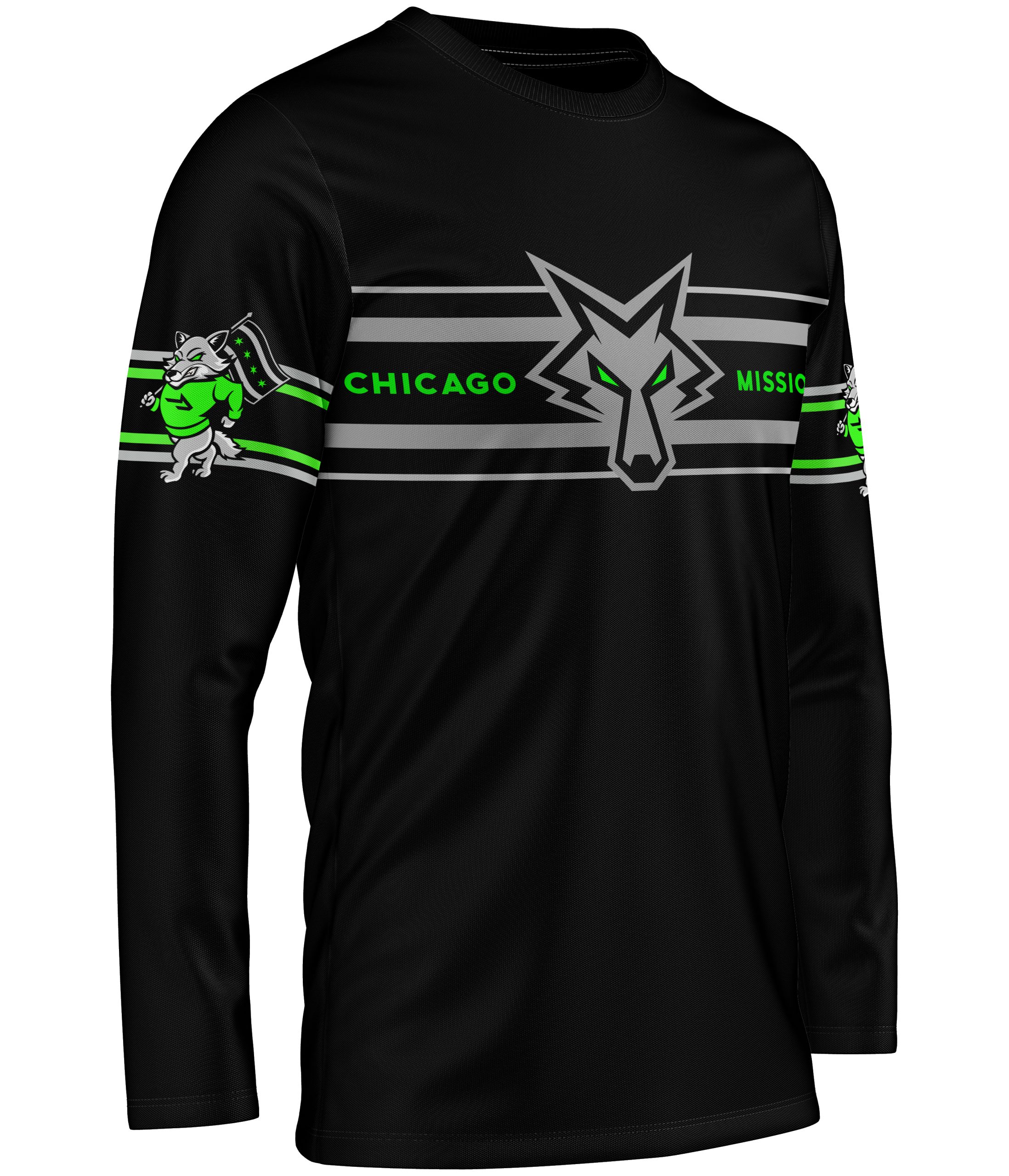
The third mark simplifies the identity into a standalone coyote head shaped with the letter “M.” This version was designed for versatility and quick recognition across apparel and branding. It keeps the aggressive tone of the primary mascot while offering a clean, modern icon for everyday use.