Chicago Knights Dek Hockey
The Chicago Knights project was a personal branding initiative focused on reimagining a Dek hockey team with a stronger, more modern identity. The goal was to take the existing brand and elevate it to a wider, more competitive level—creating a look that felt sharper, more professional, and built for long-term growth.
This project centered on giving the Knights a complete facelift, developing a visual direction that better reflects the strength, tradition, and intensity associated with the team name while aligning it with the fast-paced nature of Dek hockey.




BRAND MARKS
Primary Mark
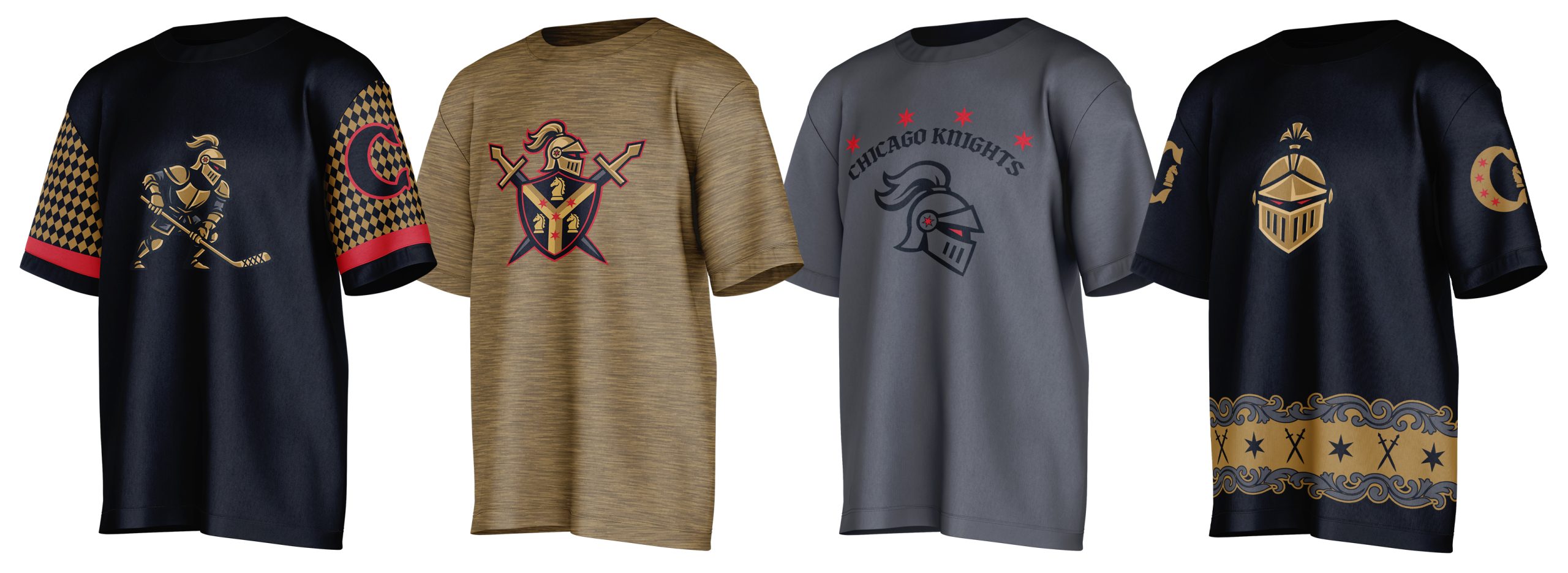
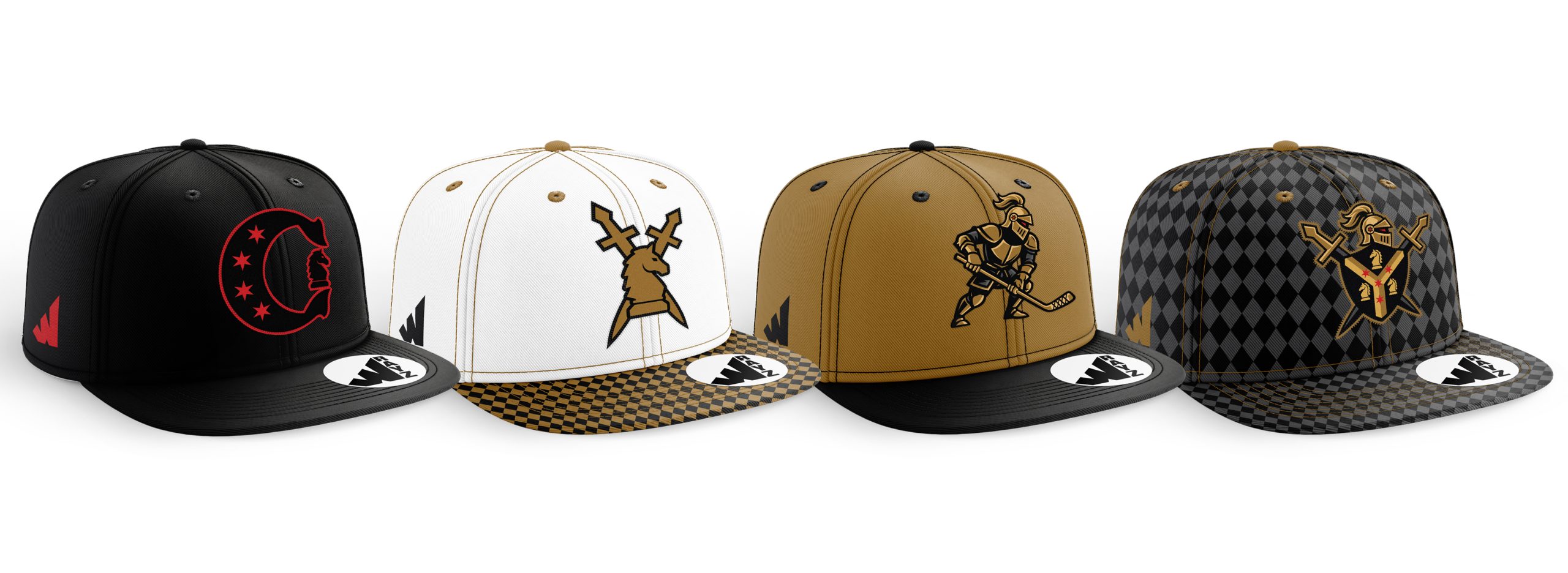
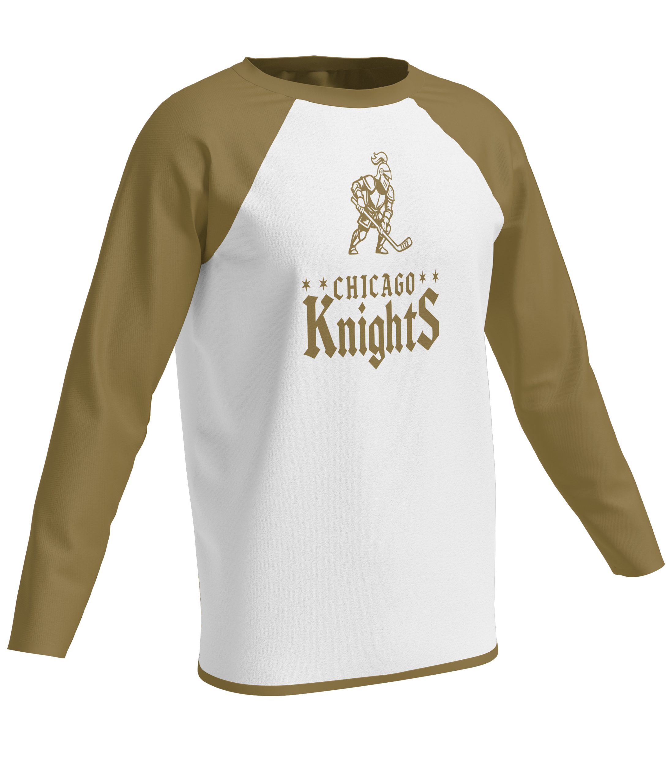
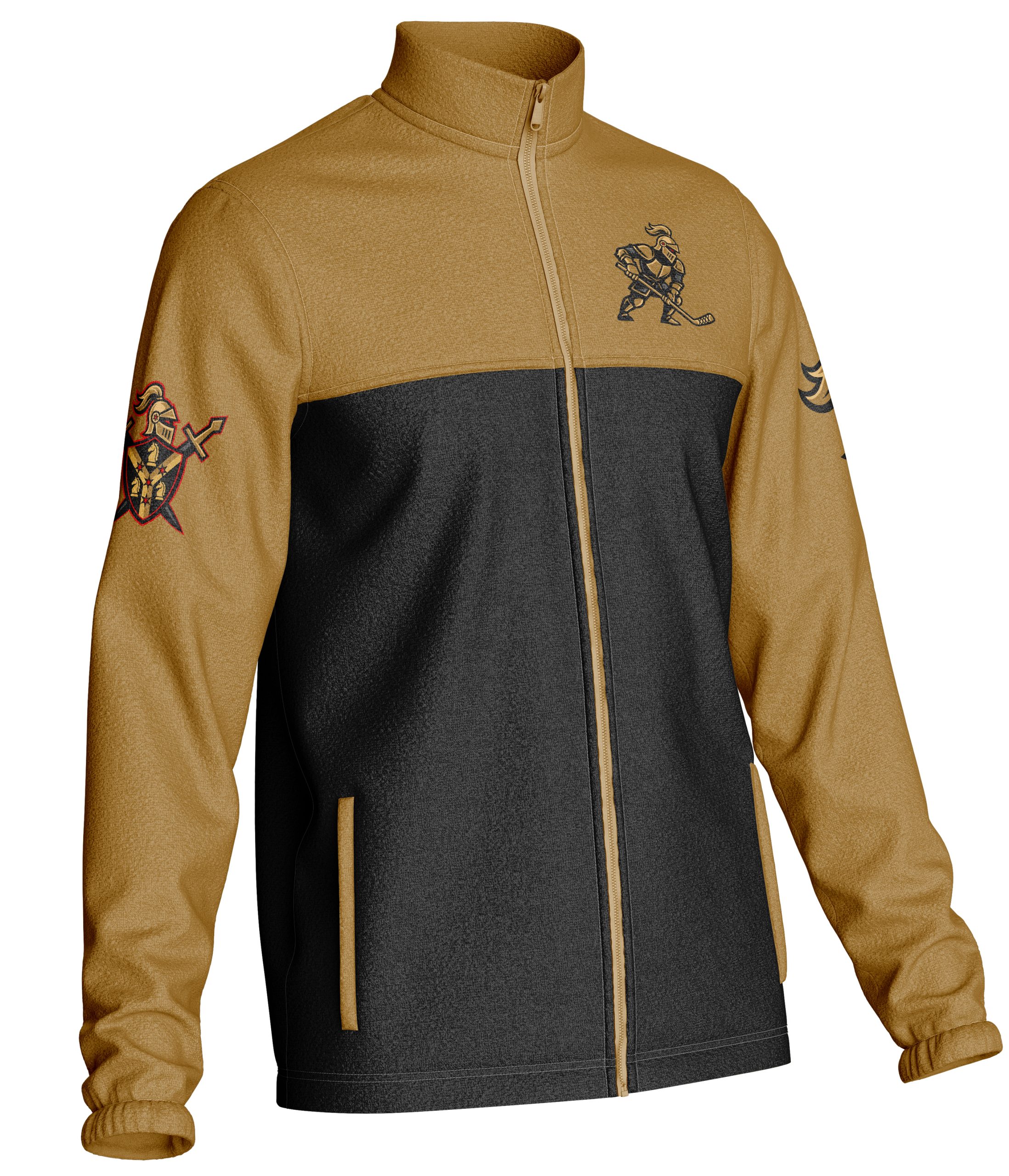
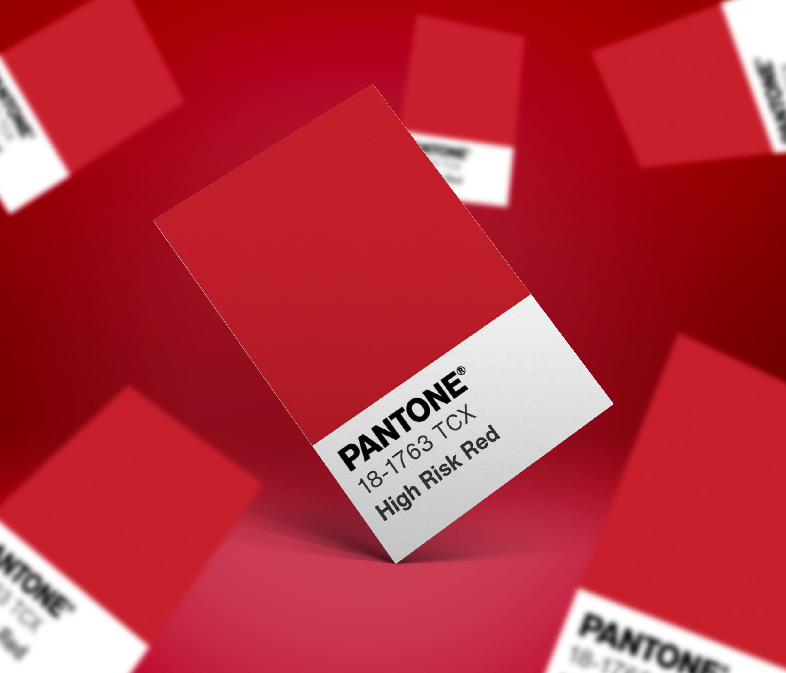
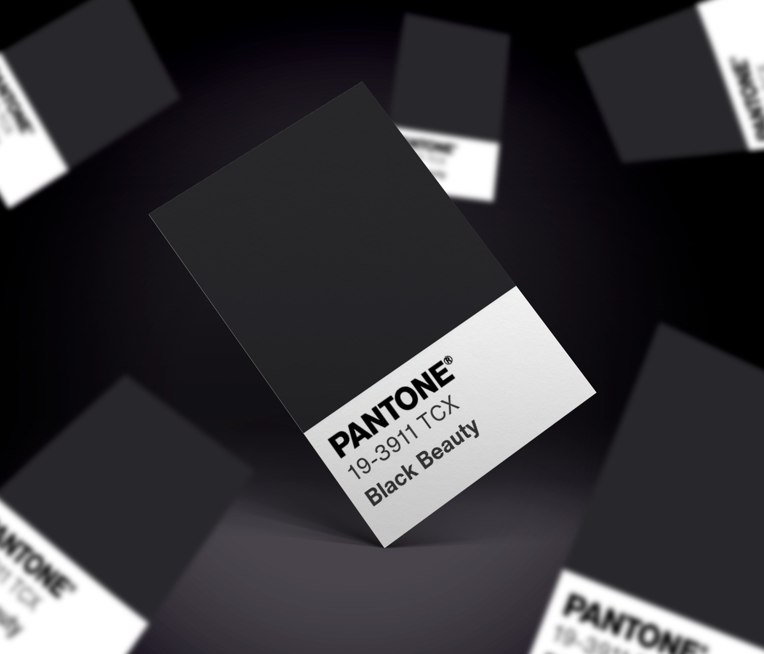
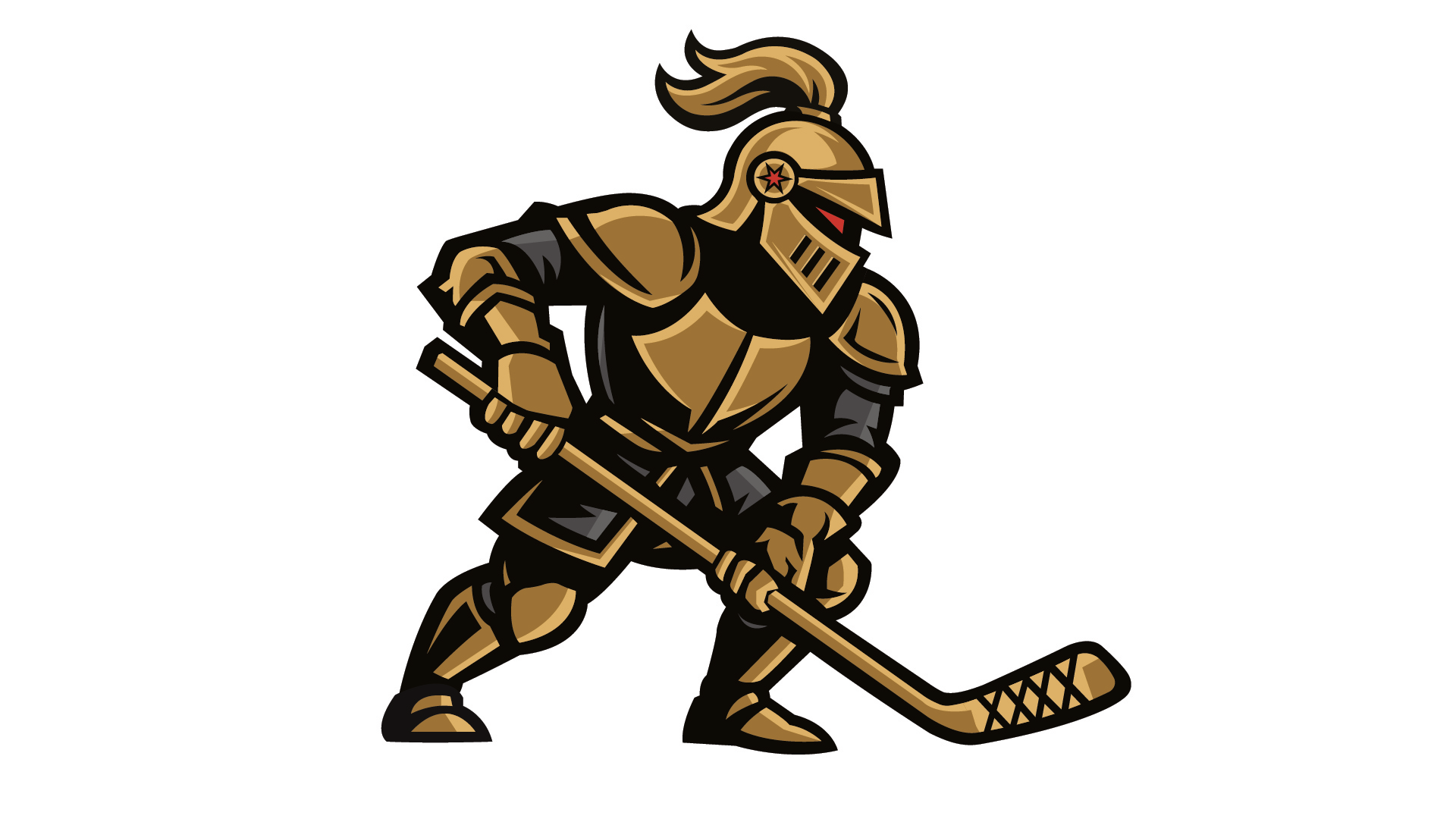
The primary mark features a bold knight character holding a hockey stick, reimagined with a stronger and more modern presence. The color palette was updated from the original yellow and black to a richer combination of gold, black, and red—adding depth and intensity to the identity. Subtle details, such as a Chicago star on the knight’s helmet and a glowing red eye, enhance the intimidation factor while tying the design back to the city.
Secondary Mark
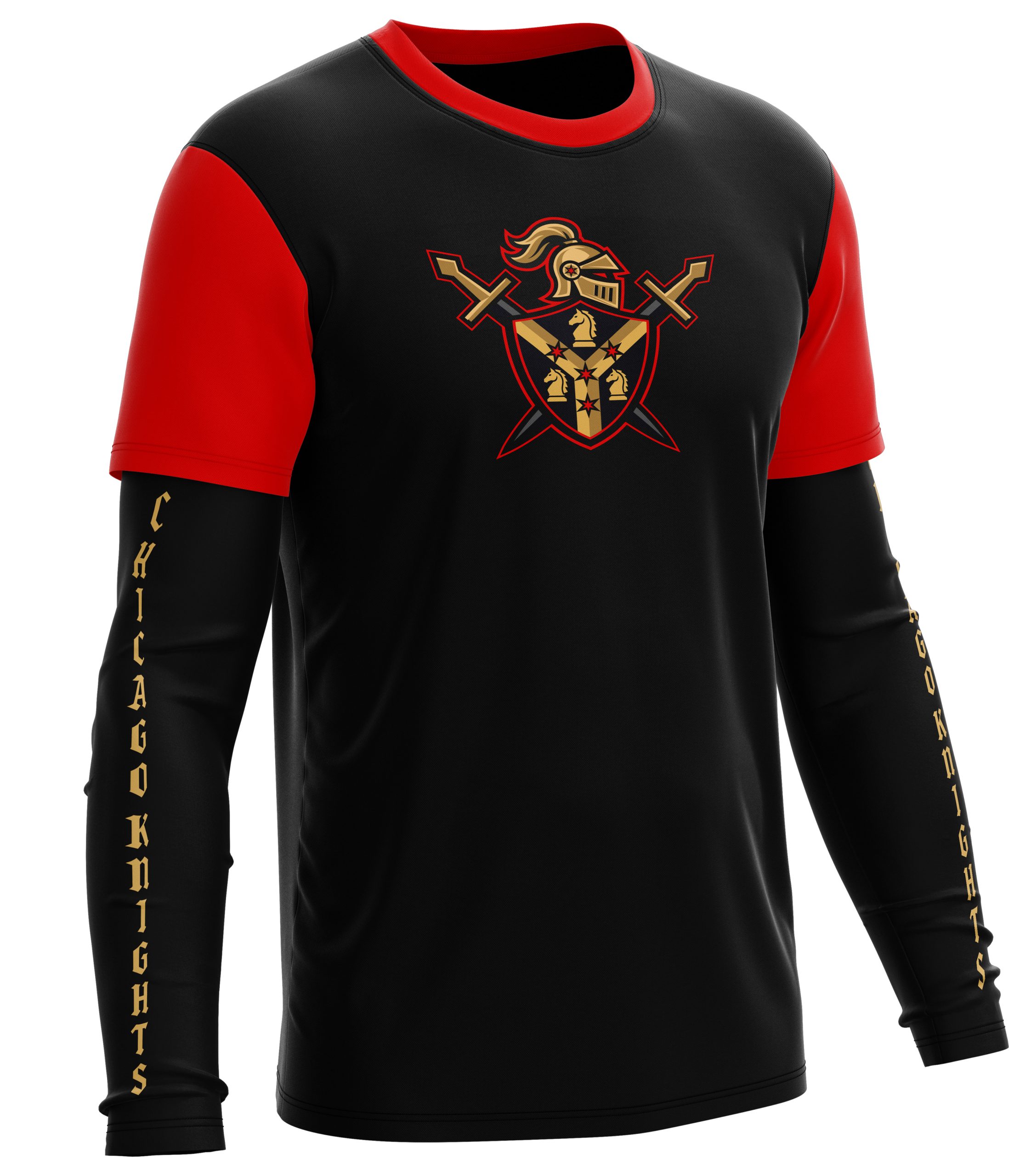
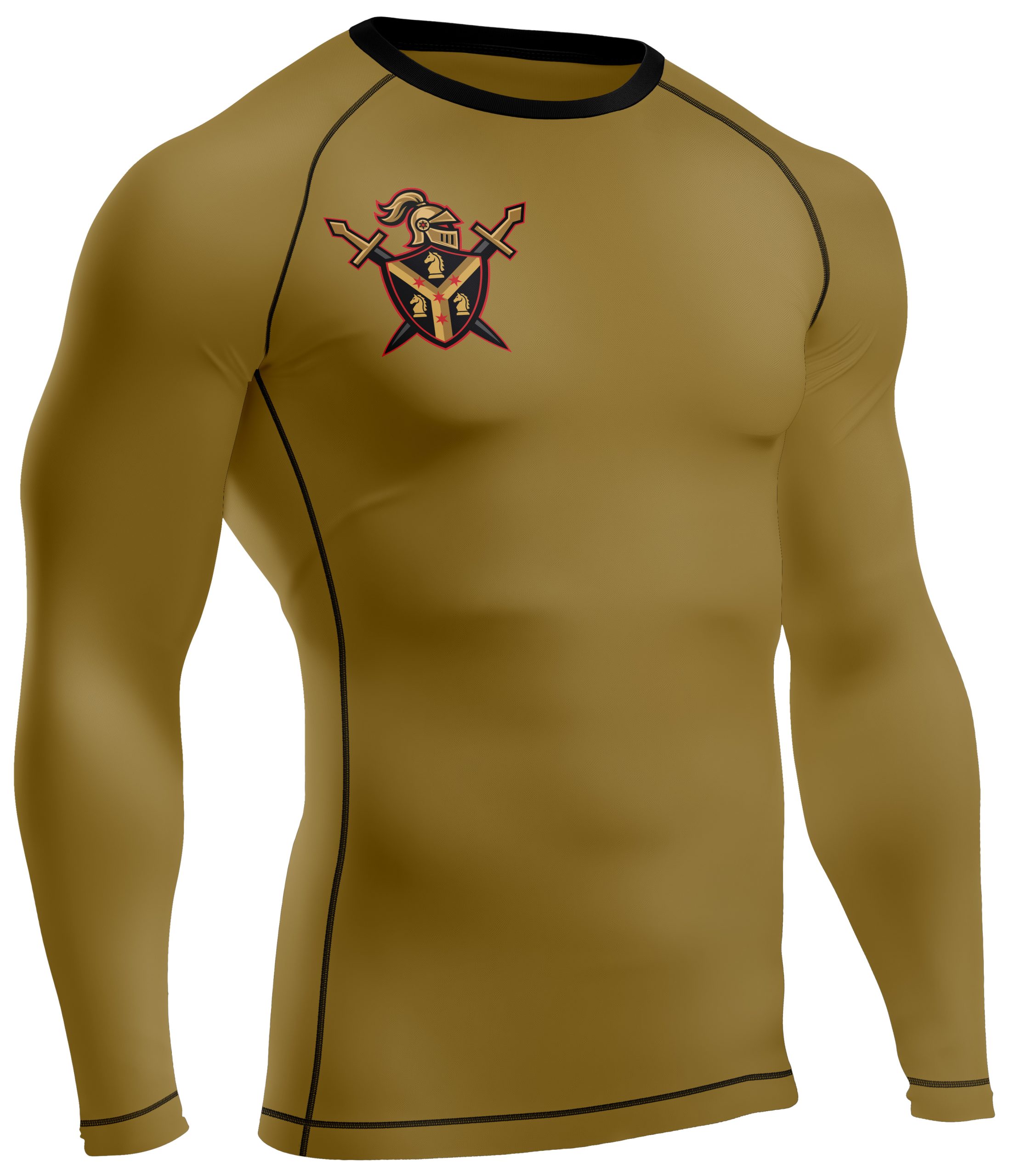
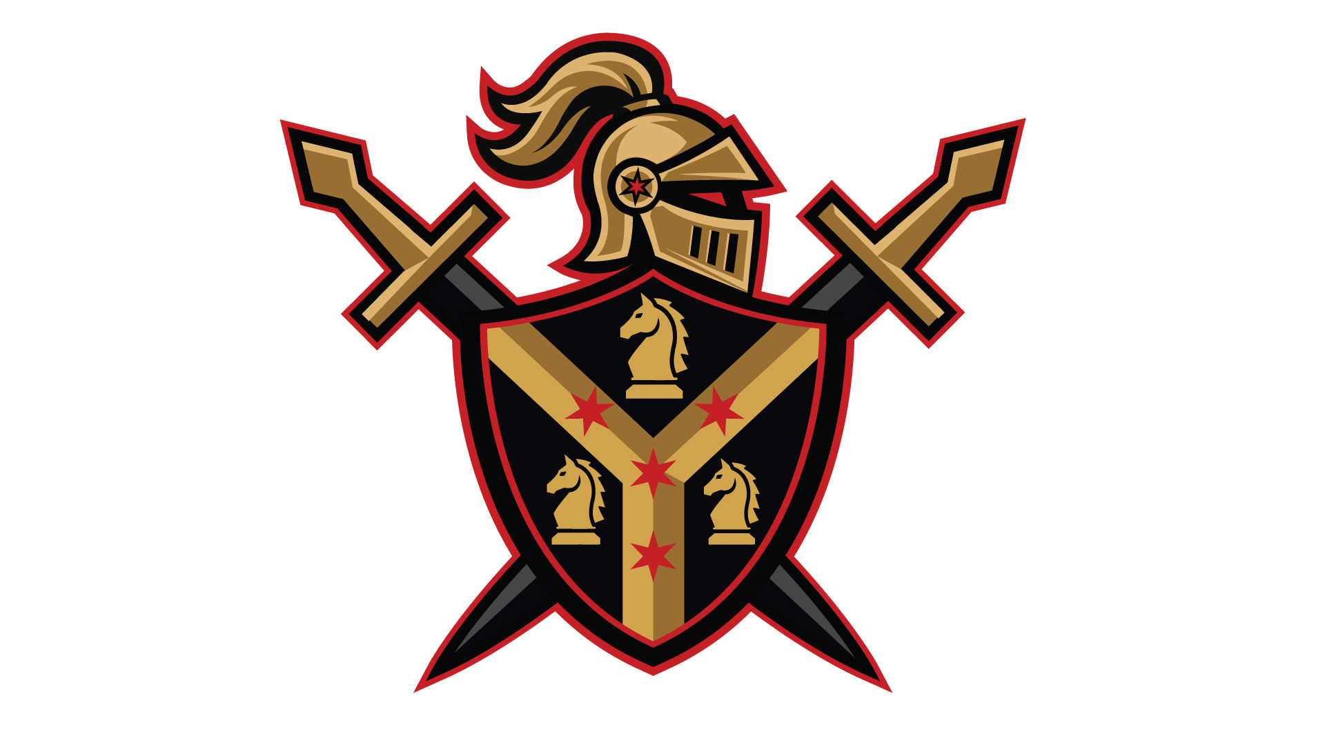
The secondary mark builds around a knight head placed over a traditional shield design. Within the shield, the Chicago Municipal “Y” is incorporated, layered with four Chicago stars to represent the team’s city roots. Surrounding the design are three knights, symbolizing the 3-on-3 format of the league, while crossed medieval swords behind the shield reinforce strength, tradition, and battle-ready energy.
Supporting Mark
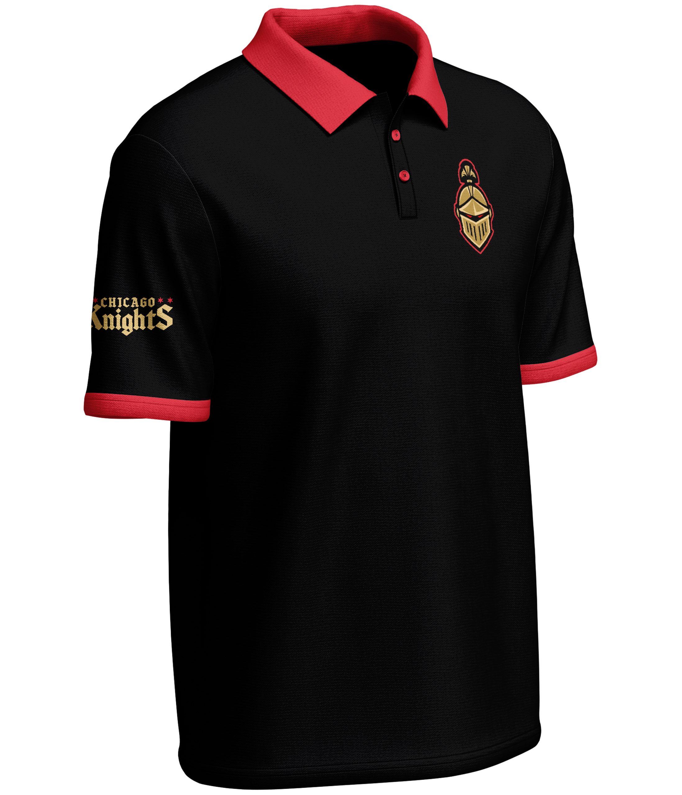
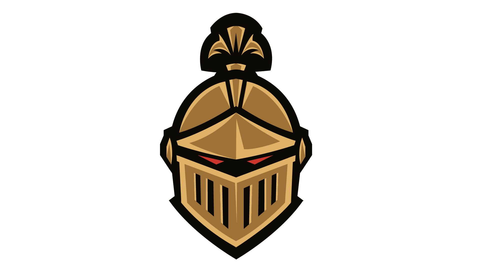
The tertiary mark introduces a more dimensional knight, facing directly forward with a stronger, more aggressive expression. Enhanced with glowing red eyes, this version adds depth and intensity while offering a different perspective of the character. It is designed for smaller applications such as shoulder patches and shorts, where a bold, compact mark is needed.
Supporting Mark
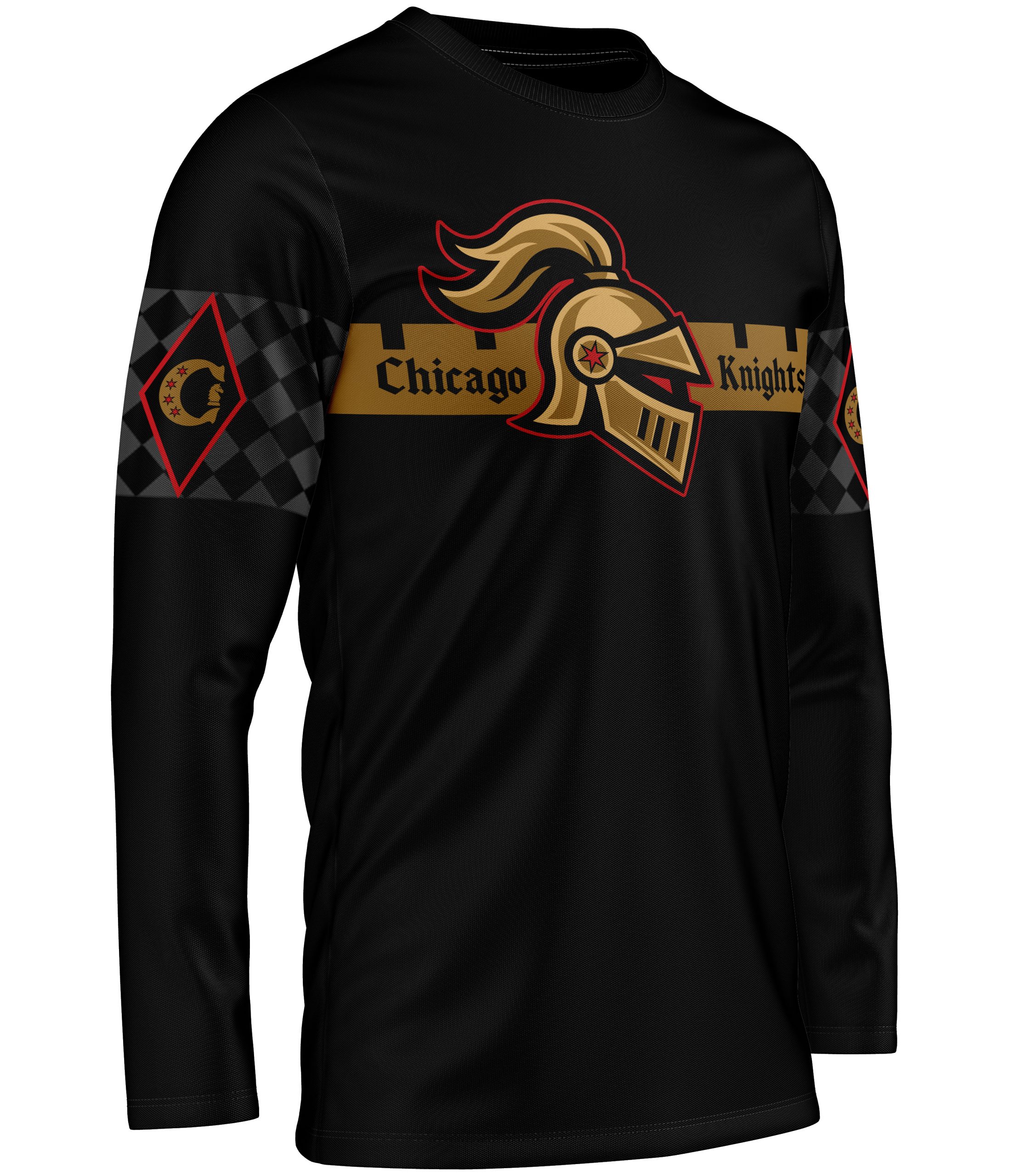
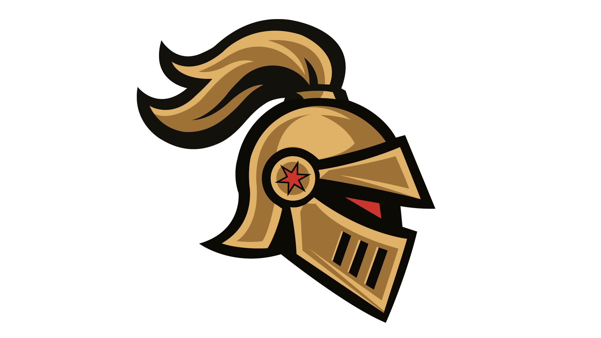
The final supporting mark is derived from the primary logo, offering an alternate variation that expands the brand’s flexibility. This version allows for creative versatility across different applications while maintaining consistency with the overall identity, giving the team more options for apparel, merchandise, and branding execution.