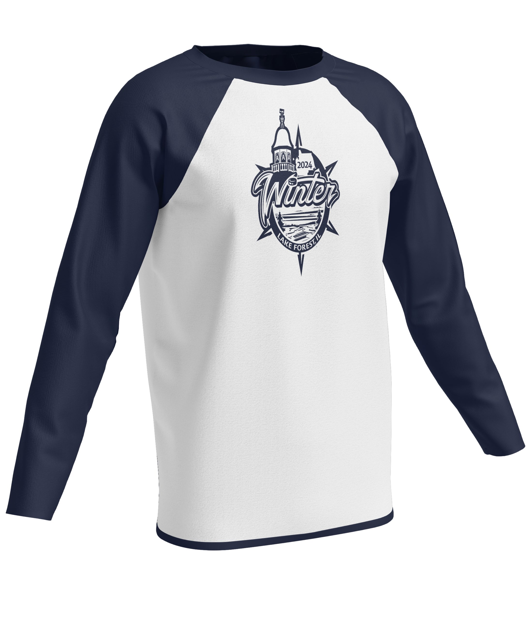
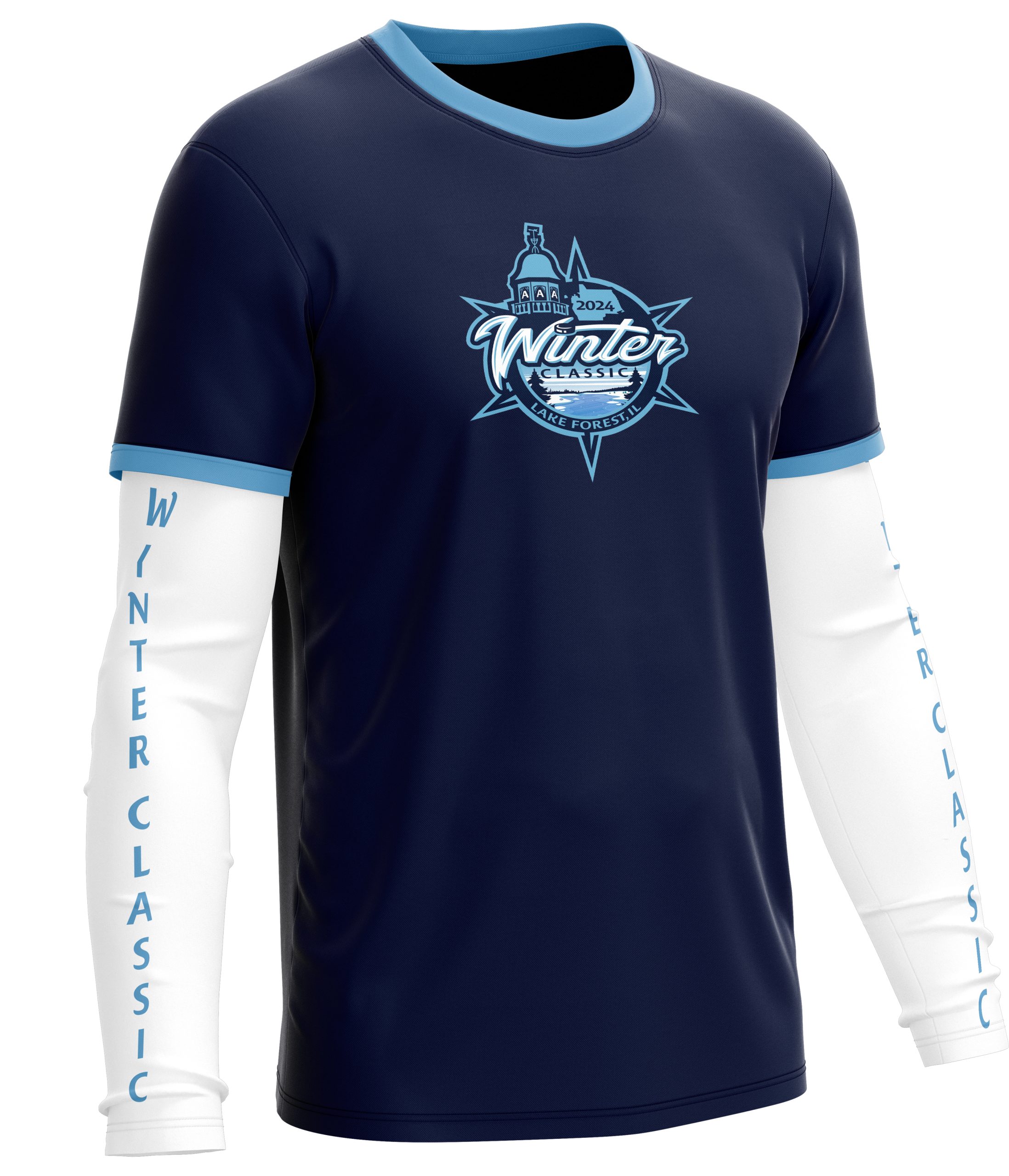
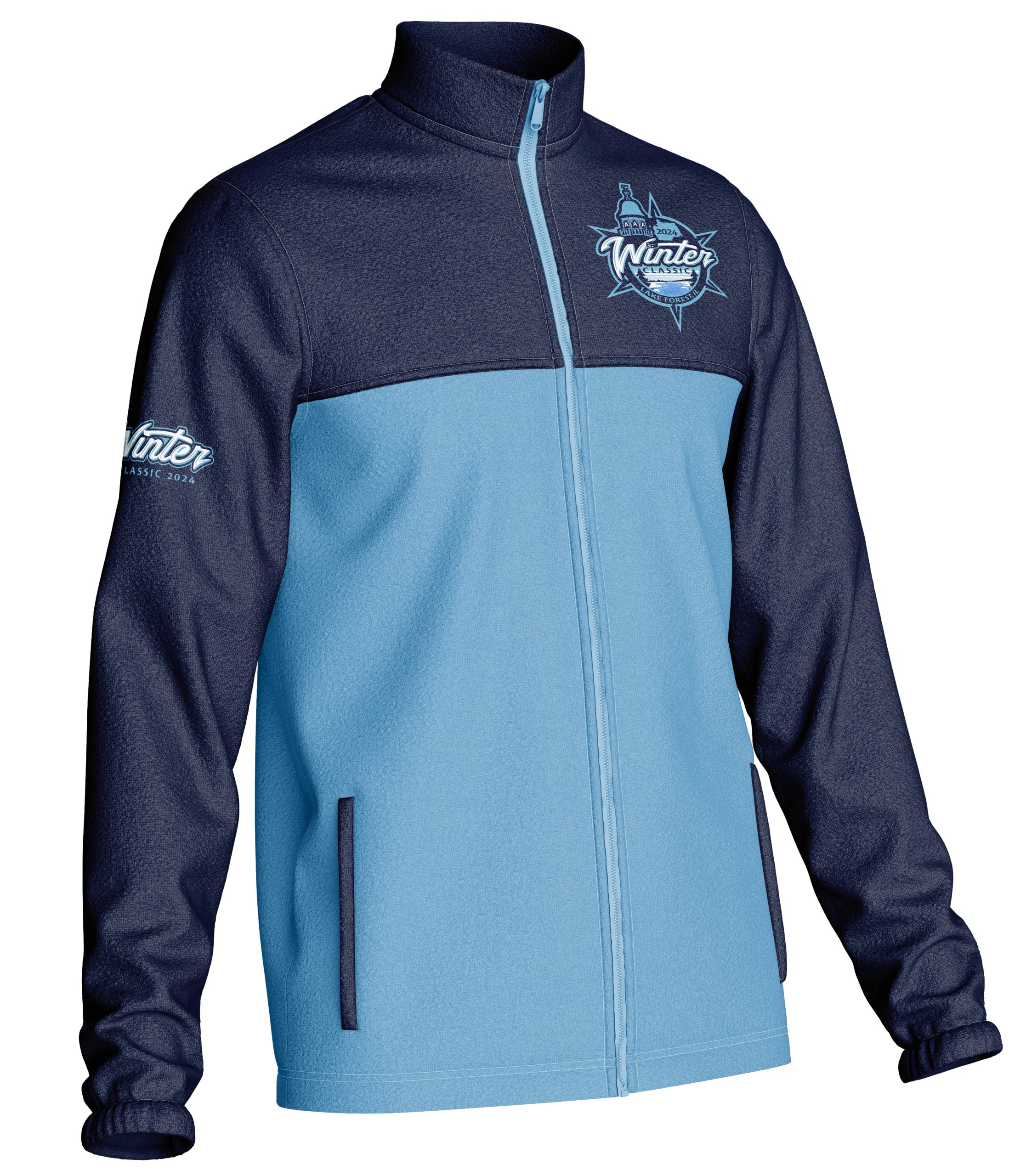
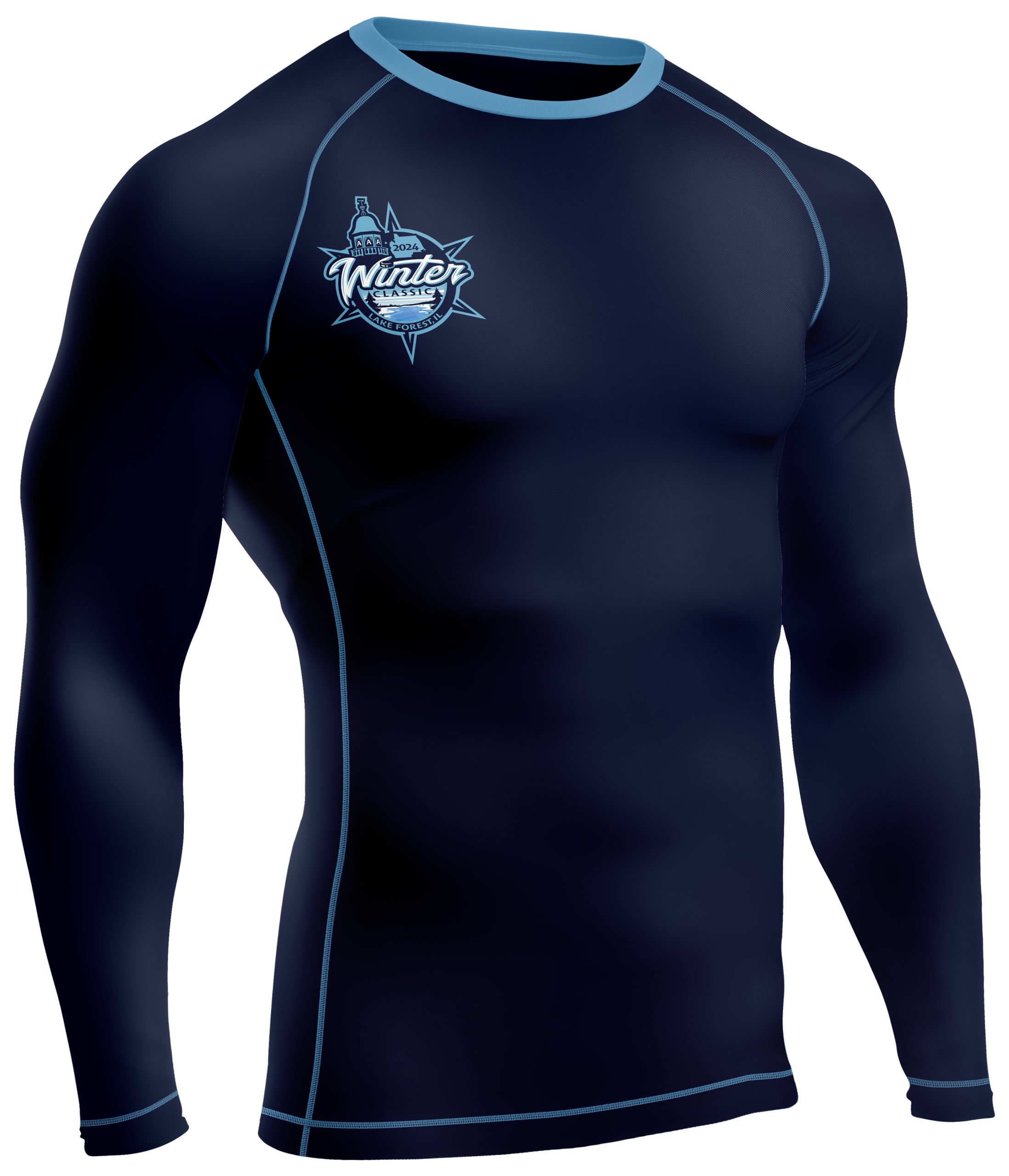
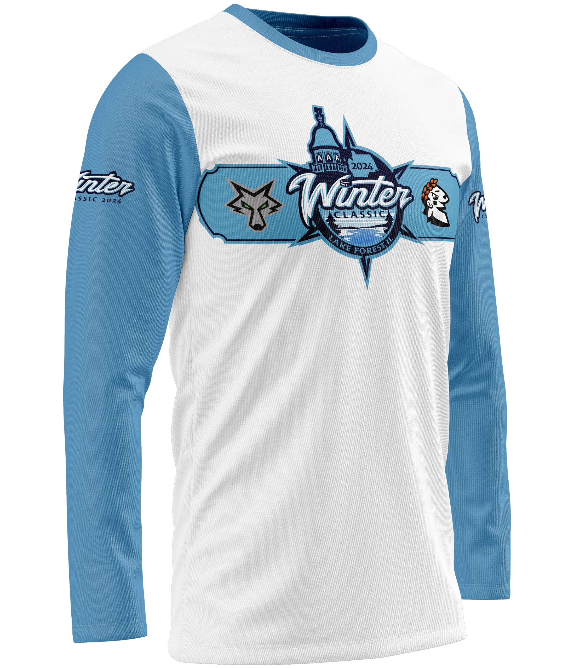
AAA WINTER CLASSIC 2024
The project for the 2024 AAA Winter Classic began when the client approached me with a clear vision: to create a logo that would capture the significance of an outdoor hockey event while reflecting the identity of the host location. They wanted something bold and memorable—something that felt like a true Winter Classic mark—but also carried meaning beyond just the game itself.
While they had a general direction in mind, including inspiration from recent Winter Classic designs and a specific color palette, they were looking for a creative approach that could bring everything together in a unique way. The goal was to design a logo that didn’t just represent hockey, but also told a story about Lake Forest, Illinois, the community hosting the event, and the Chicago Mission as the home team.
From that initial conversation, it became a collaborative process—taking their vision and building on it with thoughtful design elements, storytelling, and a deeper connection to the location. The challenge wasn’t just to make something visually strong, but to create a logo that felt authentic, intentional, and worthy of the event it represented.


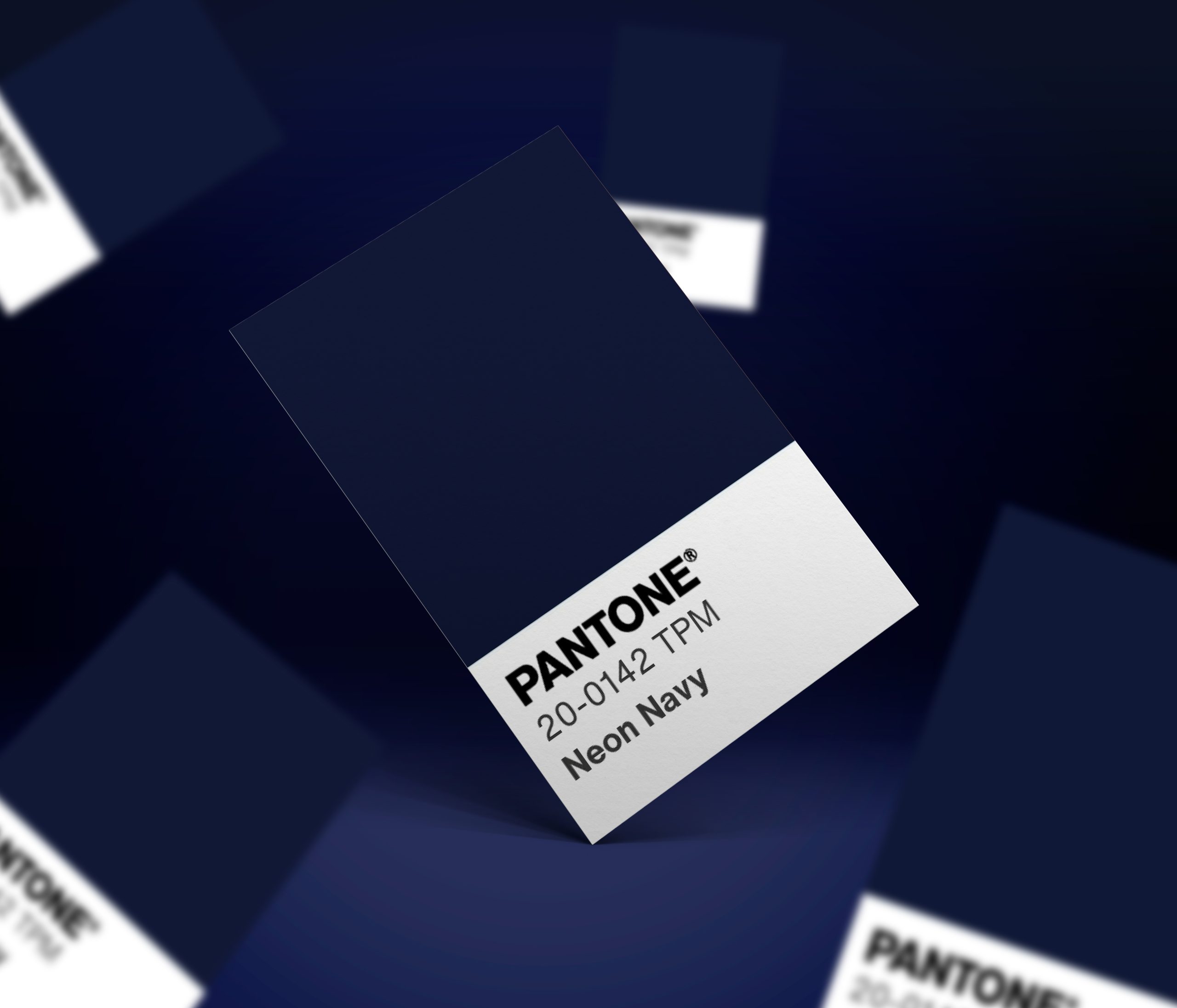
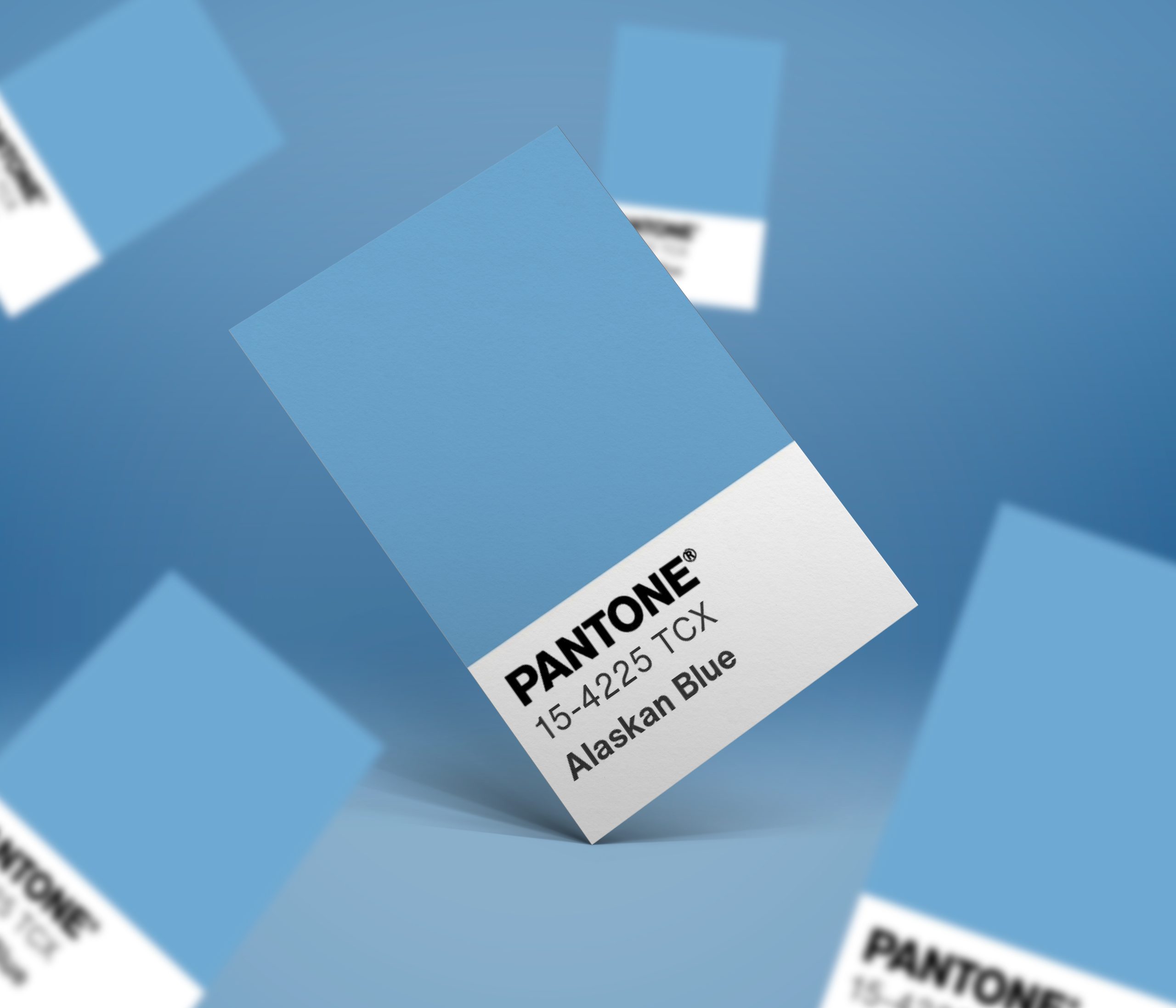
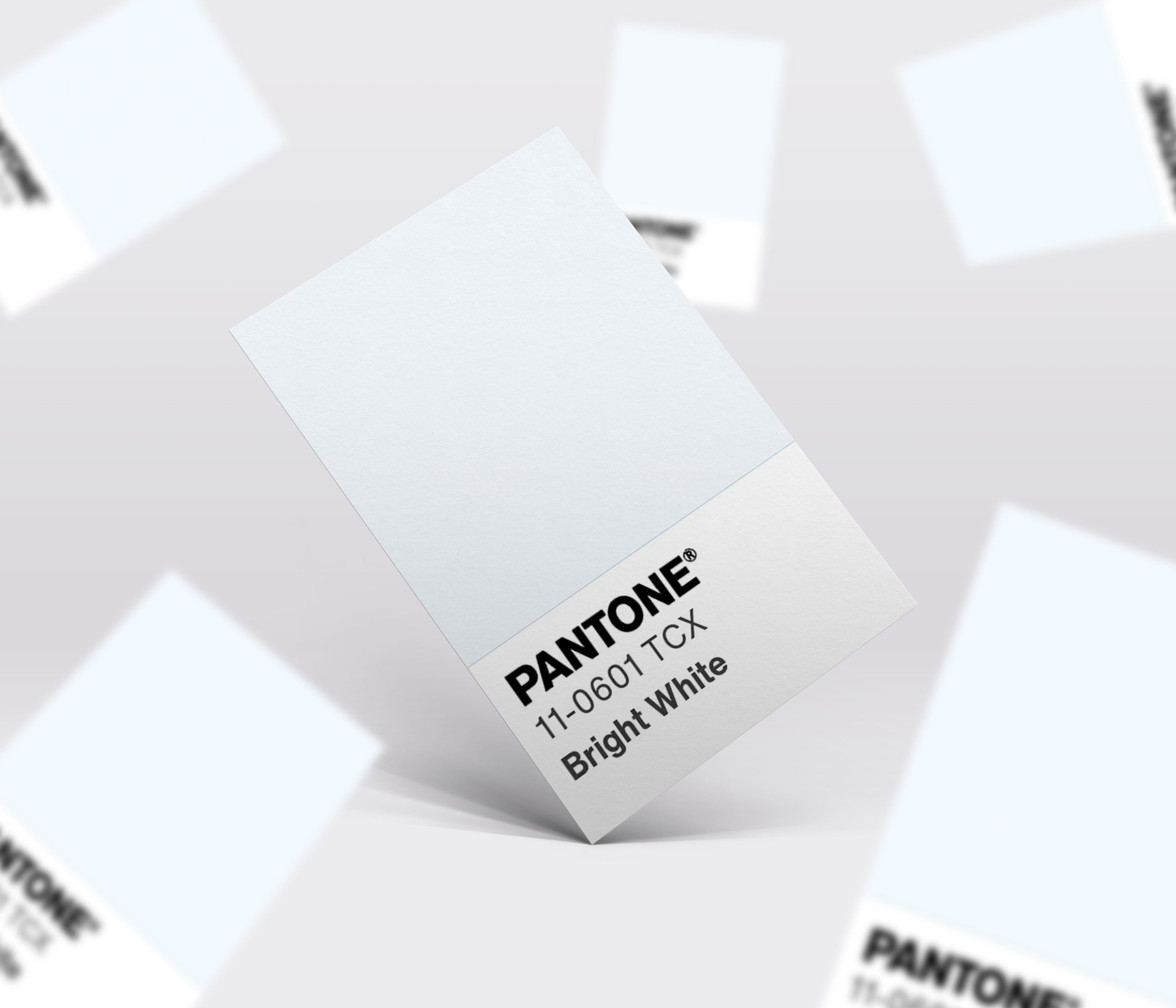

BRAND MARK
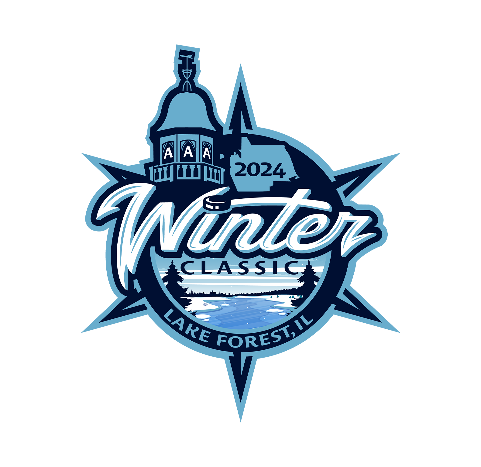
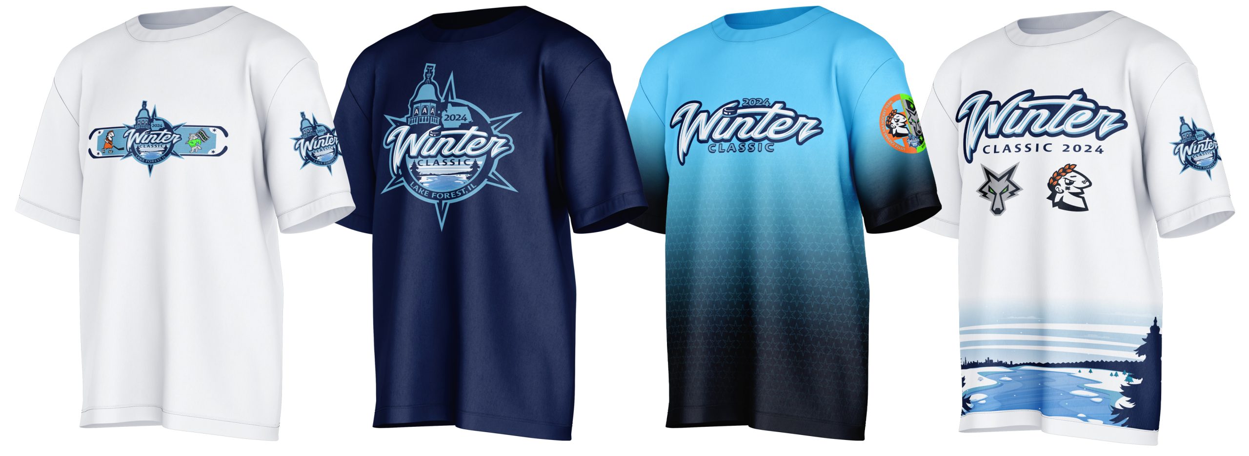
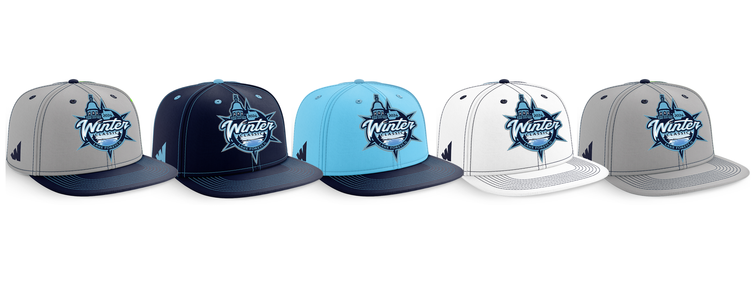
2024 AAA Winter Classic Logo
The 2024 AAA Winter Classic was a new creative challenge—designing a logo that captured both the energy of outdoor hockey and the identity of its location, Lake Forest, Illinois. Inspired by the bold style of recent Winter Classic designs, the goal was to create something authentic while tying in the community’s history and environment.
A key concept was incorporating Lake Forest City Hall architecture, using negative space to embed “AAA” within the structure. This connected the location with the level of play. A weathervane was added and pointed west, symbolizing the Chicago Mission’s roots, while the city outline and event year grounded the design in place and time.
The Chicago star served as a unifying element, bringing multiple design aspects together. To reflect the outdoor setting, the logo also features a frozen landscape, trees, and a subtle Chicago skyline, blending the natural beauty of Lake Forest with the city’s presence.
In the end, the logo became more than just a mark—it told a complete story, combining location, team identity, and the spirit of outdoor hockey into one cohesive design.